Wix vs Webflow

In this head-to-head comparison review, we’re going to look at Wix vs Webflow. Arguably, these two brands are the best website builders on the market and they both specialize in allowing their users to create world-class designs without the need to know any form of coding. If you are trying to decide on which website builder is best for your business, you’re in the right place. This article will outline the pros and cons when looking at Wix vs Webflow to help you choose the right platform. You’ve already made the right decision choosing between these two brands, but which is better?

Wix is the older of the two platforms. The company launched back in 2007 and since then has supported more than 150 million websites around the globe. It makes designing a website a quick, easy, and most importantly an enjoyable process. That’s largely down to the seamless drag and drop editor and huge app marketplace that allows you to add lots of functionality to your website.
Webflow launched in 2013 with a website building platform that takes care of everything from hosting to selling products. The silicon valley founders managed to create a slick online visual editor that can’t be beaten in terms of what it can produce. Webflow has helped more than 200,000 businesses create professional-grade websites.
Both platform’s stand-out feature is their drag and drop visual editor. However, does Wix or Webflow have the most well-rounded platform? As you can see from our ratings, we think Wix just about wins the battle. Does it outperform Webflow in all aspects though? Or, are there some categories where Webflow comes out on top of Wix? Read the rest of our expert head-to-head Wix vs Webflow review to find out.
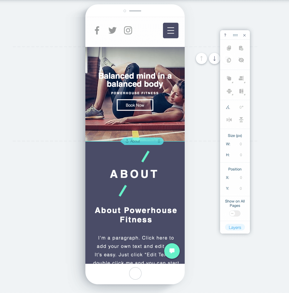
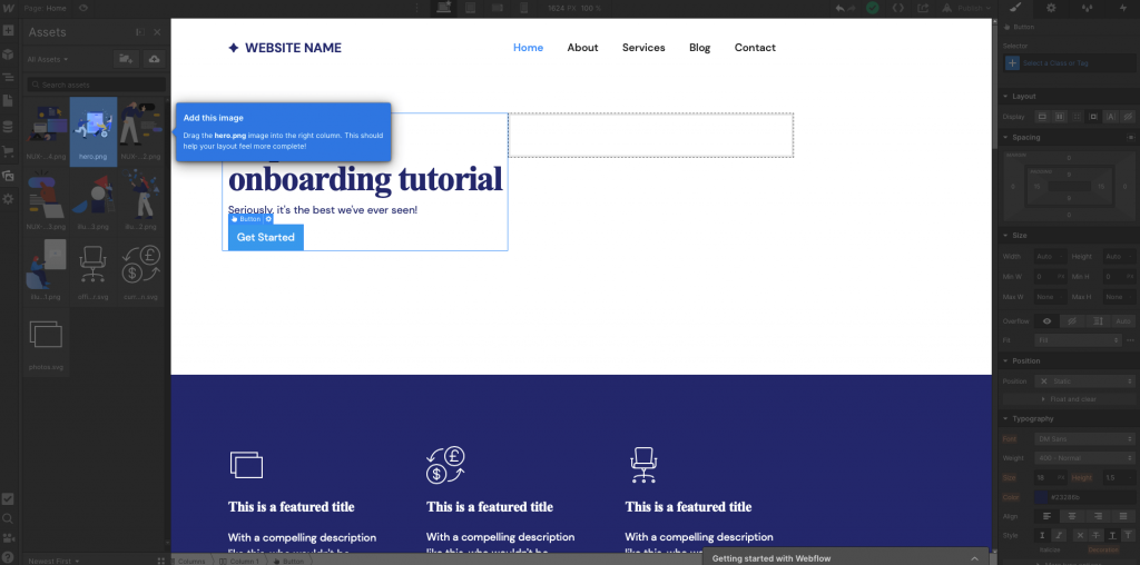
If you read our in-depth Webflow review you’ll notice that we quite often reference the fact that Webflow isn’t the most beginner-friendly platform. That being said the user interface is a pleasure to use and very intuitive. The drag and drop editor combines with a snap-to-grid function to help you create perfect alignment in your designs. There is also an impressive guided tour that walks you through how to complete basic and complex tasks within the editor such as adding titles, editing fonts, and optimizing for different screen sizes. Not to mention the dozens of video tutorials that teach you about other features. The thing that lets Webflow down on the beginner-friendly scale is the sheer amount of design options that would take a long time to master and become proficient with. So most beginners or people who want to create a website quickly will be overwhelmed with the number of options.
The Wix platform on the other hand is just as intuitive and strikes a perfect balance between enough advanced features to create quality designs while still feeling simple. What makes Wix stand out for beginner users though is the Wix ADI. You simply have to answer a few quick questions and the artificial intelligence designer will create a bespoke website template with all the features you need. You’ll be staring at a ready-to-go website within 5 minutes. It will just need the finishing touches. The Wix blog and help center also houses comprehensive information, tutorials, and user guides to help people get up to speed with the platform.
Both Wix and Webflow have great user interfaces that users intuitively pick up and for those that don’t, they have plenty of support in the form of how-to videos and written guides. The first reason Wix comes out on top in this battle though is that they have created a better balance between the number of features and keeping things simple. The second is the Wix Artificial Design Intelligence that helps novice users create bespoke web templates with everything their website needs within five minutes.
Sorry beginners, but we’re going to throw you out of consideration for this round. We’re purely going to judge the two platforms on the level of design that’s possible, regardless of how difficult it is to achieve. While you can create world-class website designs on both platforms, there’s a clear winner, and that winner is Webflow. To give you a flavor of why we think that, check out Heco’s website that was built using Webflow. Do we need to say anymore?
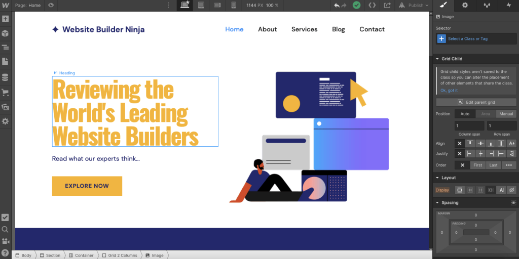
For those of you who didn’t check out the Heco website, here’s why Webflow cannot be beaten in terms of design capabilities. It offers the basics such as professional, mobile responsive web templates and a bunch of top-notch content blocks and elements. However, it goes a step further by giving you complete control over the CSS files without having to touch any code. You can edit the layout, spacing, size, positioning, typography, borders, background, and more for each content block. All you have to do is hit a few buttons in the editing sidebar. Not only that, but you can create advanced effects on Adobe After Effects and simply drop the files into Webflow to create a dynamic and interactive website that adapts as the visitor moves their cursor around your website.
Please don’t underestimate Wix’s design capabilities though, it’s still possible to create quality designs. Take a look at the Thank God It’s Monday website as a prime example. You also get more template options as Wix offers more than 500 compared with Webflow’s 130. It’s also possible to create advanced design features like animations, video backgrounds, and scroll effects. So, it’s no slouch either when it comes to design capabilities.
Both platforms offer world-class design features making them two of the best in the game when it comes to website builder design capabilities. However, the level of granular control achieved with the CSS file editing abilities and the pairing with Adobe After Effects makes Webflow the more advanced platform in terms of the designs it can produce. Wix, you’ve got some catching up to do in this battle.
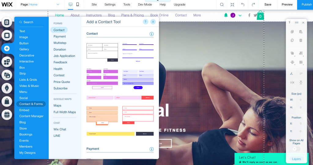
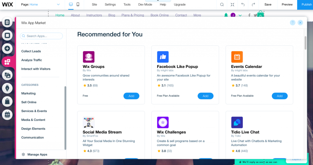
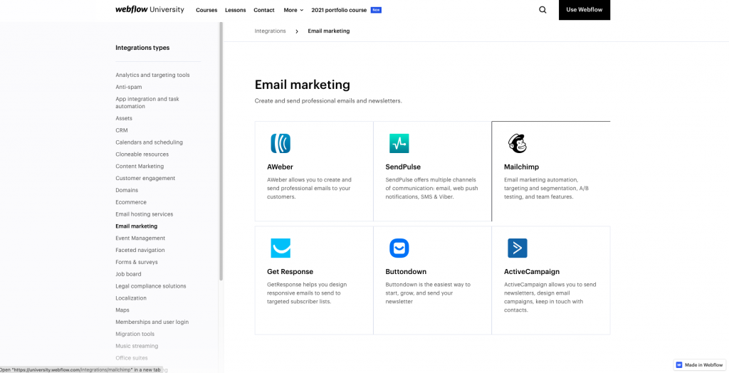
The battle over which platform has the best features and additional tools is a close one. Both platforms have an extensive list of third-party applications that can be added to your website. Wix has its marketplace with over 300 popular apps and Webflow has Webflow Integrations which has 60 integrations plus Zapier which allows you to connect with 3000 additional apps. So you won’t be short of additional plugins whichever platform you decide to go with.
The standout feature for Wix has to be the Artificial Design Intelligence that we’ve already discussed. It’s an extremely powerful tool for beginners and anyone trying to create a website quickly. The second standout feature is Wix Velo, which used to be called Corvid. Wix has decided to rename it recently as the previous name was only one letter off COVID! Good move if you ask me… So, what Velo does is allow Wix users to get behind the code of their website for complete control over the designs and provides a platform that developers can use to build, manage and deploy professional web applications quickly.
For Webflow, again we’ve already mentioned it but the ability to easily upload Adobe After Effects files and control them with the Webflow interaction controls has to be listed as a standout feature. Also, the Webflow CMS is great for speeding up and streamlining big and complex content projects. It allows you to create content templates and link them to CSV files that will automatically populate the template rather than having to build and edit 100+ pages.
If have to choose a winner, I have to choose Wix. However, it’s a close battle. Wix just wins for me because their standout features cater to both the beginner and the advanced user. Whereas, Webflow’s standout features and tools will only be used by the most advanced users which is a small number of people. However, thanks to the large listings of third-party applications on both sites you will be able to find the additional functionality you need, regardless of your niche.
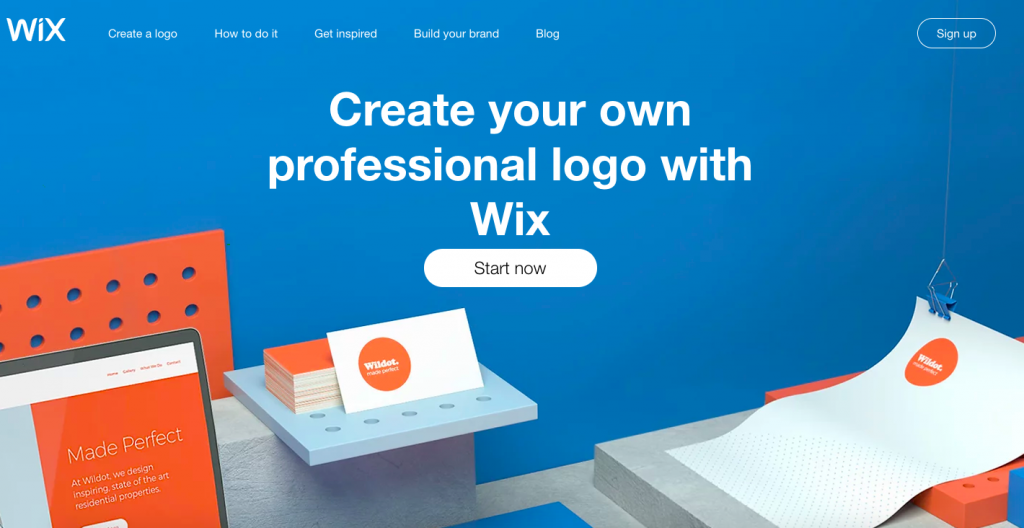
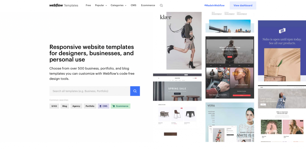
An important part of any website’s marketing campaign is SEO. Even though Wix gets a bad wrap for SEO, both have similar SEO editing features that allow you to create alt-tags for images, customize meta-titles, and edit meta-descriptions. They both create automatic sitemaps and are mobile-friendly. The main difference between the SEO features is the loading speed. Wix has a terrible loading speed which can harm your ability to rank well. While Webflow’s loading times are not industry-leading they are better than Wix.
Wix has a bunch of marketing features built into the platform. These include marketing tools like a free logo maker, email marketing features, advanced blogging tools, and social media features. The Wix app marketplace also has more than 50 marketing plugins if you’re looking for something that the platform doesn’t offer. Webflow relies on its app marketplace to provide most of its marketing features. You’ll find apps for email marketing, content marketing, analytics and targeting tools, customer engagement, and more. So, who comes out on top in this Wix vs Webflow category?
This round has to go to Wix purely because they offer more marketing features built into the platform. This makes it easier to manage and means there is less to do when you start out in terms of downloading and subscribing to additional third-party plugins. However, if SEO capabilities are important to you, Webflow does come out on top for SEO.
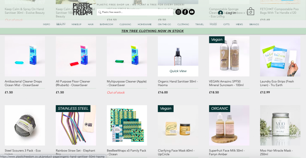
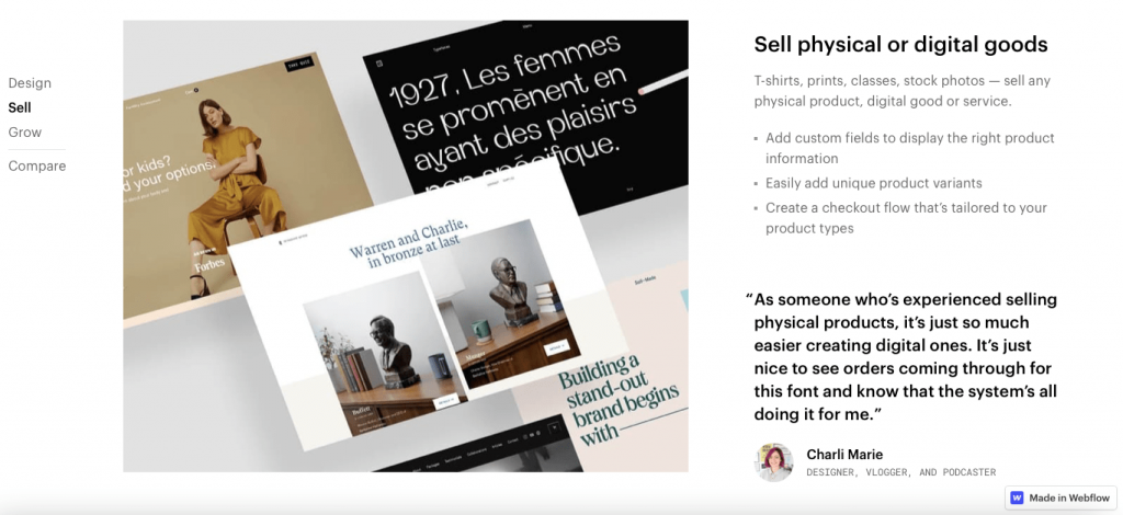
The battle for the best eCommerce platform in the Wix vs Webflow debate is a close one. Neither brand is a dedicated ecommerce platform but that doesn’t make them a bad option if you’re looking to start up an online store, especially if you care about the design of your store. Platforms like Shopify have a huge variety of strong ecommerce features, however, dedicated ecommerce platforms tend to lack design features, especially for beginner users. The great thing about Wix and Webflow is that even if you lack coding skills, the platforms will give you the tools you need to create an awesome-looking store and the ability to present your products exactly how you want to.
Wix has everything you need to build and run an ecommerce store. You can sell digital & physical products, add attractive product listings pages and manage your inventory from the Wix dashboard. It’s also a commission-free site that lets you accept a variety of payment methods and set custom shipping & tax rates. All the ecommerce features are easy to use and will help you to create a store quickly.
Webflow offers pretty much the same basic ecommerce features like the ability to sell digital & physical products, automated taxes & shipping rates, and dashboard order management. There are Facebook & Instagram integrations so that you can sell your products across platforms to expand your audience. And just like Wix, there are a ton of third-party ecommerce applications that you can use for things like abandoned cart recovery.
Both Wix and Webnode are great ecommerce platforms. Which one is best comes down to what you need it to do. Wix is much better for small-to-medium-sized online stores that want a professional look but don’t require much complexity in terms of design and features. If, on the other hand, you know you do want your store to do fancy things and to present your products in unique, innovative formats, the complexity of Webflow is going to allow you to do that. So, Webflow is the better option for larger, more complex ecommerce stores.
Webflow and Wix both offer free forever plans that give you the chance to test the platforms before committing any money. There’s no point arguing over which free plan is more valuable because most people want to connect a custom domain name. For that privilege, you will need to upgrade on both platforms. The important thing is that you can try both website builders for free without the pressure of a trial period. So, it’s a good start for both brands.
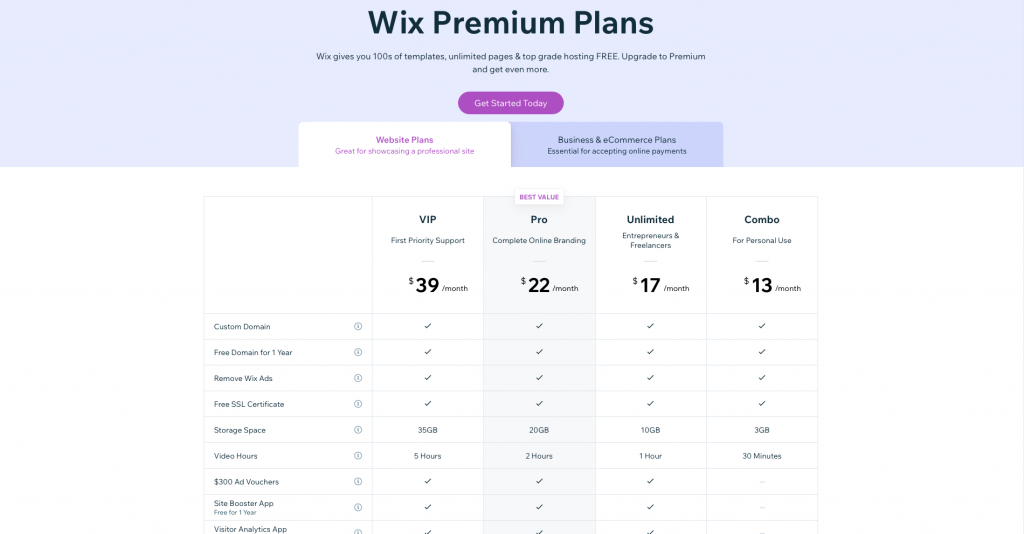
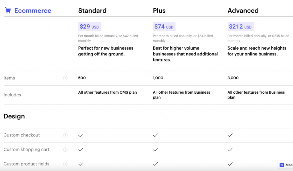
In terms of price for the entry-level plans, it’s very close. Webflow’s Basic subscription plan offers 50GB bandwidth (enough for 25,000 monthly visitors), the ability to create a website with 100 pages, connect a custom domain, free SSL security, and access to all the platform’s basic features for $15 per month. Wix’s Combo plan provides you with 3GB of storage, a free custom domain for one year, 24/7 customer support, free SSL certificates, and again access to all the basic features on the platform for $14 per month. For the most advanced subscription packages that offer the same features just with more storage and bandwidth, plus some extras, you’re looking at $45 per month for Webflow and $39 per month for Wix. Additionally, you will get $300 free in ad spend once you sign up for one of the three premium plans with Wix.
Wix has to take the win in terms of value for money as they offer slightly cheaper subscription plans all the way from the most basic to the most advanced. The added bonus of $300 free ad spend and the free custom domain for your first year adds some extra value for Wix accounts. However, I would like to add the level of design that you can achieve on Webflow would cost you thousands of dollars if you were to go with a developer. So, even $45 a month is great value for what you’re getting in return.
You’ve known from the start of this Wix vs Webflow review that we think Wix comes out on top. Hopefully, now that you’ve seen how we judged them side by side on key criteria, you see why we came to that conclusion. Both are great website builder tools that allow you to create professional websites without having to know any coding languages. However, Wix is slightly cheaper and is much better for the average user. It also has a ton of marketing features built-in and even more on the app marketplace. Not only that but it can hold its own in the categories where Webflow excels too, like design capabilities. The bottom line is that Wix is going to be the better platform for the vast majority of website builder users. That’s why it has to come out on top in a side-by-side comparison. However, you should seriously consider Webflow if you know that your site is going to be complex, you want granular, pixel-perfect control over the designs, or you want to have fancy animations on your site. If you’re looking for a straightforward but professional website, go with Wix.
Culpa irure ex veniam aliquip esse do deserunt sit duis do fugiat adipisicing minim elit. Ex voluptate et esse elit et fugiat proident esse ad. Minim voluptate pariatur commodo nisi anim nostrud eu reprehenderit cupidatat anim dolor. Et commodo aute anim enim anim irure. Ad adipisicing aliqua ea exercitation aliqua excepteur est adipisicing aliquip deserunt exercitation.
Learn More
We’ve pulled together 100 must-know website definitions to help you understand web development, SEO, and web analytics jargon. You’ll know what every confusing three-letter acronym means and more!

We take a look at the top 10 most successful Shopify stores on the internet and deconstruct their sales-boosting eCommerce optimizations so that you can apply the same techniques to your online store. Fashion Nova, Gymshark, and KITH are just some of the biggest Shopify stores analyzed in this article…

The upkeep of our site is made possible thanks to the advertising fee we charge featured website builders whenever a visitor completes a purchase through sponsored affiliate links. Financial incentives may impact the ranking itself and/or the score given. The scores assigned to featured brands are exclusively determined by Websitebuilderninja.com. The scoring and rankings are not regulated in any way and should be used by readers as guidance only.