How to Create the Ultimate Show-Stopping Logo
A logo is much more than something to chuck onto a website or business cards. Knowing how to create a stunning logo will transform your business into a brand and will lay the foundations for long-term brand recognition and customer loyalty. A logo is at the center of all forms of branding for your business and that’s why we think it’s vital to understand the basic principles of logo design as well as knowing what to think about as you go through the logo design process.
Whether you choose to use a DIY logo builder, an AI logo generator, or a service with dedicated professional logo designers, this article outlines everything you need to know about logo design. You can use it as a checklist the next time you’re designing a logo to make sure that you’ll end up with a logo that will stand the test of time and a logo that will drive brand awareness.
Why is Branding & Logo Design So Important?
Depending on which stage of your business evolution you’re at, you may or may not have given branding and logo design much thought. At the beginning of any business, people tend to focus on developing a product or service, getting a website live, and making your first bunch of sales. Sure, you would have created a logo and decided on a color palette for your packaging and website. However, everything else was more of a priority, so your branding probably didn’t get the time and budget it deserved. Once you’ve ticked those boxes, your mind will start thinking about how to optimize your business. Having a killer logo and a clear understanding of what your business stands for can take it to the next level.
If you’re reading this at ground zero, before you’ve built a website, or before you’ve finalised your product, then you’re in luck because you can start building a brand right from the start of your journey. When creating a brand the ideal process is to first decide on your business name, then create a logo full of brand personality and then use these two elements to inspire the design of your website, social media channels, product packaging and other customer facing touch points. The color themes, language and overall look and feel should be derived from your initial logo design and stay consistent throughout everything you design for your business.
So, why is building a brand so important? Your brand is the emotional response a customer has to your product and influences how it makes them think and feel as they consume whatever it is you’re offering them. Branding is your chance to control that emotional response in your favor. It’s the chance to create character, identity, and personality for your business that your customers can connect with.
But how does this translate into more sales and business growth? Well to put it simply, a consumer is much more likely to buy something again and tell their friends to buy it too if they felt like they could identify with that product, if it made them feel good, or if it added value to their life. Branding is the key to achieving this effect.
A logo sits at the core of your brand identity and is a visual representation of your company’s values, services, and mission. It will often be the first thing a customer sees when they are introduced to your business and we all know how important first impressions are… A poorly designed logo can leave the customer feeling confused and indifferent to your business. Whereas an expertly designed logo will help them to understand what it is your offering them and signify how they should feel about your business too.
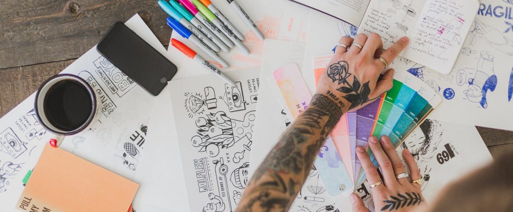
Things to Do Before You Start Designing Your Logo
We’ve tried to come up with a shortlist of things we think are important to consider before you dive into the logo designing process. The information is relevant for anyone creating a logo, even if you’re using an AI logo generator or getting a professional to do the work for you. If you do a bit of research and thinking on these four topics you’ll increase your chances of creating the perfect logo for your business (and probably save yourself some time and money too by getting it right the first time!).
1. Learn The Basic Principles Of Logo Design – What Makes A Good Logo?
The first thing to do is get to grips with what makes a good logo. If you’re going to use a DIY logo builder this is important to know so you can create a professional-looking logo, or if you’re using an AI logo generator having this knowledge will help you to understand if the logos you receive back are actually any good. Alternatively, if you plan on using a professional designer to create your logo, having this knowledge will help you to evaluate their work and give you a framework for your feedback. So, here are the key principles of logo design that you need to know about:
Simplicity

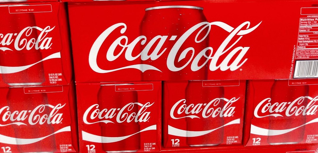
The famous phrase ‘less is more’ should always be in the back of your mind when designing a logo. A logo with only a few elements won’t date as easily and it will be simple to work with when designing other things for your business. Some of the most famous brands have the simplest logos. Think Apple, Nike, Mcdonalds, and Pepsi. You really can’t get much simpler than these.
Go easy on special effects like shadows and shading, don’t overlap elements, only include two or three colors, and give your logo room to breathe with adequate white space.
Some businesses often fall into the trap of trying to put too much text onto a logo and include a name, slogan, and explanation of what they do. This can make a design look cramped, busy, and ugly. The effect of a design with too much text is overwhelming, it will be hard to read and it will make it difficult for customers to remember and like your logo. As a rule, you should avoid text-heavy logo designs and only include a slogan if it’s really good… I mean really good! You can explain what you do elsewhere on your website and other forms of communication where there’s space to do it justice.
Originality
Striking the balance between being different enough to stand out while being memorable enough to be remembered is the key to great logo design. If you copy what everybody else has done you’ll just get lost in the crowd. Adding your company’s unique personality into your logo will help you ensure that you create something unique and original.
Versatility & Scalability
Your logo will be on your website, packaging, business cards, t-shirts, digital ads, point-of-sale items, shop signage, and potentially so much more. So, you’re going to need a design that works well in all of these places. Having a simple logo design will ensure you have a versatile logo.
Also, you’ll want to make sure that you receive vector files for your logo design. Vector files are responsive and will scale your logo up or down to fit a particular area without losing quality. This will make sure your logo looks just as good and legible on a business card as it does on a billboard.
Another great way to ensure versatility is to have multiple variants of your logo. For example, you could have a version without text, a version with just the graphic and versions with a different hierarchy of elements.
Finally, your logo will need to work on any background color so having variants in black and white and with a transparent background will make sure that you always have something that looks good.
Balance & Proportion

Balance and proportion refers to the weight or size of each element in your design and where it sits in the overall space of your logo. For example how big the icon is vs the text. This will be different depending on what your business offers as well as the size of your company. More well-known brands can get away with bigger icons whereas small-to-medium-sized businesses will need text to add some context to help customers understand what they are about.
It’s important to have a design with equilibrium and the easiest way to achieve this is with a symmetrical design, where elements are balanced either side of a centerline.
Timelessness
Designing and updating a logo frequently costs money, you’ll not only have the design cost but also the cost of updating business cards, emails, social media pages, and general website design. Updating your logo too often can also damage your brand recognition and your loyal customers may not like the new design and decide to choose another product or service that they identify with better. So, you want something that is going to last a while. Following the basic principles we have just discussed, rather than following fads will help you create a timeless design.
When looking at your final design, ask yourself the question ‘will this look good in 5-10 years time?’. Of course, it’s hard to predict the future but if you stick to a more classic design you’re much more likely to have a logo design that will last years rather than months.
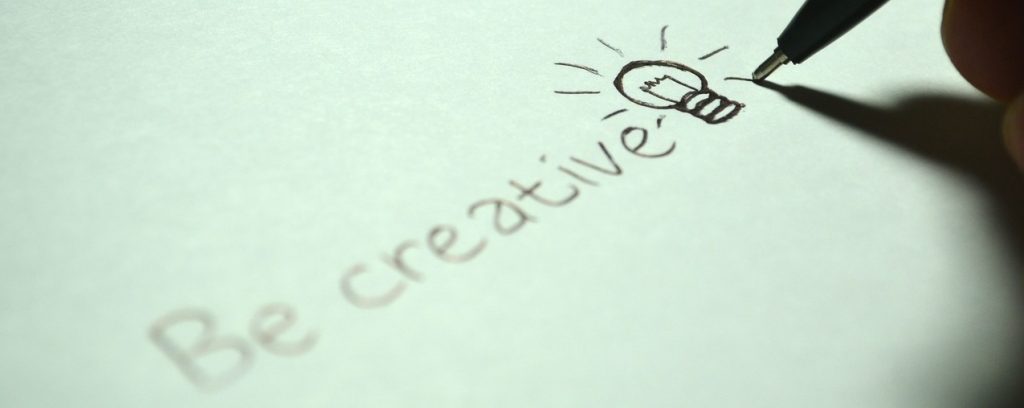
2. Get Inspired – Look At Logo Trends & Other Logo Designs

Sometimes knowing where to start with ideas for design can be really difficult. Researching the latest logo trends and taking a look at the logo designs of some of your competitors will help you to understand what looks good and what you should avoid when making your own logo. Also, when you’re working with a professional designer, having a bank of logos that you like will help them understand your preferences which they can then feed into the designs for your logo. When looking at trends just bear in mind that you don’t want to fall into the trap of using something that looks good today, but will look dated in 6-12 months.
A great resource for logo inspiration is from the blogs of established logo maker brands like Wix, Tailor Brands, and 99designs. Their blogs are regularly updated with the latest logo design trends and best practices. Take a look at this article from 99designs that features logo design trends for 2020 to get your creative juices flowing and maybe you’ll find some elements that you can bring into your own design.
3. Know Your Brand – What Does Your Business Stand For?

If a logo is going to help your business grow and drive brand awareness and loyalty, it needs to visually represent your business. It doesn’t necessarily have to show exactly what your business does but it should be relevant in some way and speak to your target audience as well. If you don’t understand what your business stands for and you’re not sure how you want it to be conceived by the target audience, it will be very hard to create a logo that your customers can identify with.
Spend some time writing down some adjectives that you would use to describe your business, develop tone-of-voice guidelines to understand how your brand speaks to its customers, and draw what your brand would look like if it was a person. Once you understand a bit more about your business as a brand, start to think of how you can visually represent it through logo design elements like color, font types, and icons.
Here’s a list of some opposing adjectives, go through them and decide which word your business is more closely aligned with.
- Classic / Modern
- Mature / Youthful
- Feminine / Masculine
- Playful / Sophisticated
- Economical / Luxurious
- Geometrical / Organic
- Abstract / Literal
4. Choose The Best Logo Maker For You
The last thing you need to do before starting the process of designing your logo is to decide on how you’re going to do it. Luckily, you don’t need to be an expert in design or know how to work Adobe Illustrator to create a logo. There are a number of online logo builders that make creating a logo much simpler. You can choose a DIY logo builder where you build your own logo using a drag-and-drop editor. Alternatively, you can use a service that generates logos through artificial intelligence designers, or some platforms allow you to work with expert freelance designers either directly, or by starting a design contest where you will receive dozens of design options from multiple designers.
If you’re not sure which logo maker service to choose, check out our comparison list of the top-rated logo makers and find out which brand we thought was best. There’s some top-line information about each of the brands and a detailed review that outlines all of the pros and cons of each service.
Things to Think About When Designing Your Logo
So by now, hopefully you’ll be starting to think about the fundamental principles of logo design, have an understanding of the personality of your brand, and have some ideas about how that translates visually into your logo design. If you’re planning on using a professional designer to create your logo then you can use this checklist to help create your brief to them and if you’re using a DIY logo builder then you can use this checklist as you make your own logo.
1. Include Your Business Name
Unless you’re a mega-corporation with global brand recognition, it’s a good idea to include your business name in your logo. This will enable you to start growing brand recognition and will make sure that customers looking at your logo know that it belongs to your business. Most business names are related to your product or services so including it in your logo adds some useful context that will let your customers know what your business is all about. There might also be logos that look similar to yours, especially if you use an AI-generated logo maker, so including your business name will make your logo unique and will stop people getting confused or mistaking your logo for something else.
2. Find the Right Fonts
The perfect font is easy-to-read, brings clarity to your design, and brings originality and personality to your design. Fonts are a great way to bring the character of a brand into the design and they should always look good, but never sacrifice readability for beauty. Try reading the fonts on different screen sizes with different levels of brightness to make sure that it can be read easily in different circumstances.
The best practice is to use one font type for your business name and a different one for your tagline or slogan. Make sure that they complement each other and say something about your brand.
There are lots of different font types but here are some of the main types and a quick summary of what they convey:
- Serif – elegance, sophistication, tradition, respectability, and reliability.
- Sans Serif – clarity, forward-thinking, honesty, sensibility, and clean.
- Slab Serif – loud, bold, confident, dependable, creative, and important.
- Script / Handwritten – elegance, freedom, creativity, feminine, unique, and artful.
- Decorative – unique, original, casual, fun, creative, and exciting.
3. Bring Your Logo to Life With an Icon or Graphic
Often the visual element of a logo is what draws the attention of people, so choosing the right icon or graphic is important when thinking about standing out from the crowd and creating a memorable design. This is because humans identify with images much faster than text, so a logo with an icon or any kind of shape will help someone to remember your brand and logo much better than a text-only logo.
If your business has a specific set of products or services then you might want to include an image that directly relates to them. For example, if you run a dog grooming business it would make sense to include a visual of a dog within your logo. If your business doesn’t have a relatable product or service then you should consider including shapes and lines to create visually stunning images that will draw the eyes of potential customers and help them to remember it more easily. Most DIY logo makers will have thousands of icons to choose from. So, there should be something in their icon libraries that works for your business.
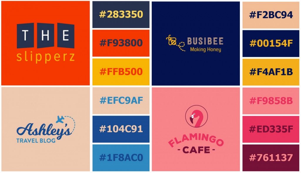
4. Use The Right Colors
The use of colors in your logo will emit a message to consumers about your brand, give it a personality, and a feeling when people interact with your products, services, and other customer touchpoints. There is a psychological effect on the brain when it sees colors and you can use this to manipulate how people view your brand. If you want to deep-dive on the psychology of color read this article on the fundamentals of color psychology from 99designs.
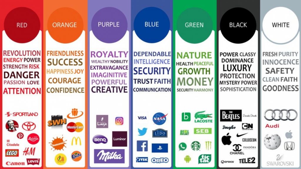
Take a look at the list of colors below to find out what feelings they evoke in the brain. If you consider how you want your brand to make people feel, this should help you decide on what color you should focus on. Try to only include between one and three colors in your logo to keep it simple, clear, and versatile. Any more than that and it will become confusing and hard to look at.
- Red – passion, excitement, playful, young, comfort, love, romance, warmth
- Yellow – friendly, cheerful, happiness, energy, positivity, youthful, comforting, affordable
- Blue – wisdom, loyalty, respectability, calm, trust, healing, confidence
- Green – natural, balance, calm, restful, fresh, health, wealth, harmony, tranquility
- Orange – playful, energetic, change, warmth, vitality, active, invigorating
- Purple – royalty, sophistication, soothing, creativity, luxury, truthfulness, high quality, spiritual
- Brown – seriousness, grounded, supportive, reliability, nature, rugged, warm
- Pink – feminine, energetic, cheerful, soothing, sexual, nurturing, romance, love
- Grey – timeless, practical, neutral, efficiency, serious, mystery, classic
- Black – powerful, professional, seriousness, intelligence, glamour, luxury, modern
- White – neutral, pure, sophistication, efficiency, exclusive, luxury, clarity, innocence
5. Uppercase or Lowercase?
Small details like uppercase and lowercase text in your logo design can add to the message you’re trying to convey. More often than not, uppercase logos give off a sense of authority, assertiveness, and presence. Whereas, lowercase logos can give off a casual and approachable vibe.
Upper or lowercase text alone won’t create a huge impact, but it is another layer to your design that you should think about to add to the overall effect of the design.
6. Do You Want to Include a Tagline? Here Are Some Guidelines
When taglines are done right, they can add context and personality to your logo design, but be careful not to confuse things or devalue your brand with a sloppy tagline. If you’re unsure that it adds value, it’s probably best to leave it out. Some things to adhere to if you are going to include a tagline are:
Character length – your tagline should be shorter than a business name in the design. Even though the font will be smaller allowing you to add more words you should still limit it to around 25-30 characters.
Font thickness – use a thinner font for the tagline which will allow you to make sure it’s smaller than your business name and allow your business name to be the prominent feature.
Font type – use a more basic font type for the tagline to make it easy to read even at a smaller font size. A more basic font type will also make it easier to complement your feature font type that you’ll use for the business name. Sans-Serif fonts work well for taglines.
Think About Spacing
White space, or negative space, is important in any logo design because it’s needed to allow the eyes and the brain to process the visual stimulus. A logo design with adequate spacing will be much more memorable than a cluttered design because it’s much easier for the brain to digest everything from simple, well-spaced logo designs. If you decide to use a frame in your logo design make sure there is enough room between the edge of the frame and the visual and text elements of the design to avoid a cluttered and cramped look.
8. Ensure Readability

The main purpose of a logo is that it can be recognized easily, even from a glance, and sometimes even subliminally as you walk past adverts in the street or scroll past branding on your phones. To ensure your logo can do this, it needs to be readable on any type of screen and at any print size.
Font types, font sizes, colors, and spacing all play a role in readability, so focusing on those steps will help you to create a legible, easy-to-read logo. Take the time to look at your logo design on different screens, print it out at different sizes, and see if you can still see it clearly. If you feel like it could be better, try and go back to the appropriate step and optimize the design for better recognition and readability. It will be worth the effort!
9. Alignment is the Key to Success
Alignment is the golden rule of design. Now that you have all of the elements you need on the page, it’s time to make sure they appear balanced. This is because the brain naturally tries to find patterns and symmetry, so having your logo elements aligned will draw the attention of someone’s eye and make it much more memorable and pleasing to look at.
There’s room for creative freedom here and there is no set rule as to how you should align your design elements. However, if you’re a beginner you should stick to aligning everything in the same direction which could be either to the left, right, or center.
10. Make Your Logo Versatile With Multiple Layouts
As we discussed before, your logo needs to work in a number of different locations from websites, to business cards, to billboards. So, having a variety of formats will make sure that you have a logo variant for every location that it might end up. Every business will vary in what it actually needs and will use on a day to day basis, but, if you have the budget there is no harm in having all the bases covered. Here’s a list of all the logo variations you might want to consider:
- Primary logo – This is your go-to logo design that includes all of the elements such as icon, wordmark and tagline.
- Wide – You might already have a horizontal logo design, but if not, you’ll need to think about creating one for when space is limited. For example, website navigation bars, Facebook cover photos, and letterheads.
- Tall / Square – Having a logo design that’s tall and fits into a square is great for social media profile pictures, website headers, and printed material that has limited spacing like business cards.
- Icon – Icons are great for when you want to include your branding when there really isn’t much space. They work really well in responsive web designs and can appear when screen sizes get too small to show your primary logo.
- Wordmark – Again this is used when there is limited space and when an icon is not appropriate. It might not have the visual elements but it will still put your business name in front of the consumer’s eyes.
- Single color – Having a single color variant is useful when including your logo over busy backgrounds.
- Black & white – A strong black and white version of your logo design will keep the design looking sharp and readable when it’s printed on low-res printers and when photocopied.
The Bottom Line
The most important things to remember when designing or reviewing logo designs are the basic principles. You want your logo design to be simple, original, scalable, versatile, balanced and timeless. If you manage to tick all of these boxes with your logo design you will have something that will stand the test of time, drives brand recognition and lets your customers know what your business is all about. Our checklist of things to think about when designing your logo will help you to follow best practices and make sure that your logo design does everything it needs to. If you’re creating a logo yourself use the information in this article to help you include all the elements you need. Alternatively, if you’re going to use an AI logo generator or a professional logo designer to create yours then use this information to help review, analyze and critique the logos you get back from your chosen services.
If you’re still unsure about what the best logo maker is for you, our team of experts has tried and tested the best brands on the market to make your decision easier. Head over to our logo maker comparison page now to find out which brand we thought was best.
Written By
What is a website builder?
The simplest answer to the question of what is a website builder is that it’s a software programme that helps you to build a website without having to manually code anything. But, how do they work?
Cheapest Website Builder 2021
Building a website doesn’t have to cost the earth. We’ve pulled together a list of the cheapest website builders and ecommerce platforms to help you find an affordable option for your website. Not only are they the cheapest, but some of them are the best of the best…
