How to choose the right website template design on a website builder
Creating a stunning website has been made a lot easier with ready-made template designs that have been created for website builder platforms.
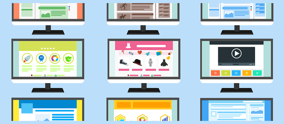
But, you’ll face an often overwhelming amount of options. Sometimes there will be hundreds to choose from and very little guidance from the platform itself on what is actually best for your business. Instead, they just show you what looks good.
You might be tempted to just pick any template that looks like it might work and worry about the rest later. However, this could be a big mistake as it may be difficult or sometimes impossible to change the template after you go live without manually transferring over all of your content.
Combining our collective years of experience from the team here at Website Builder Ninja and the knowledge from our own trials and errors, we’ve created a list of things that we wish we’d thought about the first time we picked a web template design.
This article will list everything you need to think about when looking at template design, starting with features, touching on the overall look and feel, and finishing with customer support.
We’re hoping it will help you get it right the first time around and choose a template that’s right for you now and right for you in the future as you and your business grow.
Know what you want & need from your website

Okay, I’m sorry if this first point sounds like I’m trying to teach a fish to swim, of course you already know what type of website you want.
However, if it’s your first time using a website builder, knowing what you want is just the start, knowing exactly all of the elements you need is more difficult. This is because it often takes some trial and error to figure this out, and by that point, you might have already picked a bad template.
Every business will require different features from a website in order to be successful, some will be easy to handle and come as standard in many templates, whereas others are more complex and therefore it will be harder to find an out-of-the-box solution.
Therefore, understanding the features of your website is a crucial step that will allow you to pick the right website template and the right website builder platform that can cater to your needs.
Make sure that it is scalable and allows you and your business to grow in the future. For example, if you’re an online store that only sells one or two things now but you know you want to sell more in the future, you will want a template that can support large product listings.
Here some quick questions to help you think about what other features you might need for your website:
- What type of content will you use the most (galleries, images, articles, links, videos, product listings)?
- How many titles will you need on your navigation menu? Different menus will be able to handle different amounts and lengths (we’ll get to that later!).
- Do you need a login or members-only section?
- Are you selling any products? Does your site need to be set up for ecommerce?
- Will you need a blog?
- Do you want to build a mailing list? If so, you’ll need signup forms.
Look for features & customization
Website builder platforms are great at showing you the sexiest templates and tempting you into picking the one that looks best.
Before you click ‘sign up’ and start the speedy onboarding process, take some time to explore the templates and features pages of the platform that you think you want to use.
If you’re not sure which platform to choose yet, head over to our home page to see our top ten list of website and ecommerce builders and read some of our in-depth reviews to get a sense of which one would be best for you.
Here’s a list of common features that your business might need that you can use to cross-reference when looking at features.
- Lead capture forms (email sign-ups)
- The ability to accept payments (eCommerce sites)
- Subscription or members-only content
- Video integration
- Comment sections and forums
- Video backgrounds
- Third-party integrations (such as CRMs or bookings systems)
- Menus & online ordering
- Product listings and a storefront (eCommerce sites)
- Advanced blogging features
- Media galleries
- Event listings & ticket sales
The more things you think your business website will need from the list above, the more likely it is that you’ll find it difficult to find the perfect template and will need third-party plugins to make it work.
If you know you’ll need lots of advanced features, then choosing a website builder platform with a large app market will be a good move to ensure that the platform can support everything your business needs.
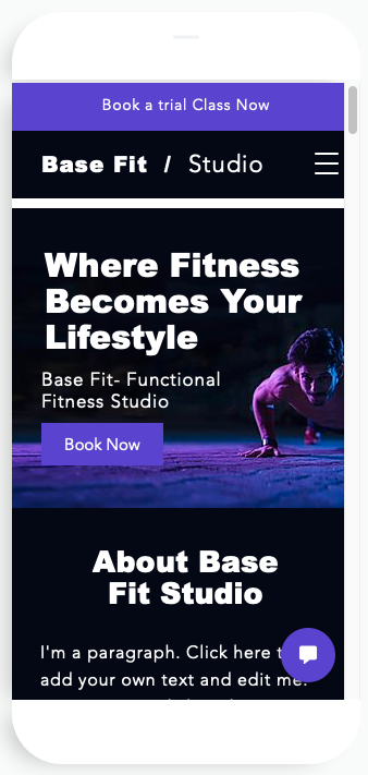
Make sure it’s responsive
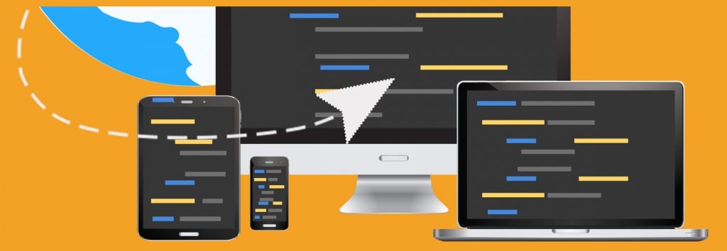
Mobile traffic made up 52.6% of global web traffic in 2019 which means that your content is going to be viewed on a variety of different screen sizes.
So you need to make sure that any template design you choose is mobile responsive.
While all of the template designs on website builder platforms are designed to be responsive, if you are purchasing a template outside of the platform, make sure to check if the design you intend to buy is mobile responsive.
If your site isn’t responsive to mobile screens it’s going to really limit your potential audience because your website will be illegible and horrible to navigate on anything but a desktop.
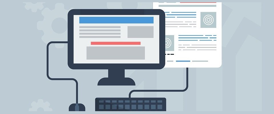
SEO friendly

A good looking website is important to impress your visitors but if your website has poor SEO it will be very difficult to build organic traffic and get people to your site in the first place. So, it’s worth spending some time to find an SEO friendly template.
It’s very hard to tell whether a template will be SEO friendly just from looking at it and it will take a bit of research to find out how well the template has been designed for good SEO performance.
Here are some things to look out for when choosing SEO friendly templates:
- Find templates with a solid hierarchy and easy navigation
- Faster loading times are always better, especially for SEO
- The ability to create HTML headers (H1-H6)
- Templates that automatically create sitemaps for easy indexing
- Optimized images – can you do this manually or automatically? Either is good
- In-text-code editors allow you or an SEO expert to optimize further
Why one-pagers are bad for SEO
Some website templates are naturally better for SEO than others.
A one-pager website is where all of the information on a website is found on a single page and instead of clicking-through to another page you simply scroll down the page or click navigation buttons to jump to each section.
This is becoming a popular choice of design because it can create beautiful websites.
However, one-pagers limit your SEO potential for a number of reasons.
- Limited keywords – a single webpage can only be optimized for one focus keyword so having one page really limits you.
- Poor loading times – trying to fit everything into one page will create a slow loading time compared with a site that spreads out over multiple pages.
- Lack of links – good SEO practice involves including internal and external links, if you have a one-pager you can only create links to a different section on the same page.
- Only one title and meta description – you only have one chance to grab people’s attention on search engine ranking pages, if they don’t like it they won’t click on your link.
Final thoughts on website template SEO
A lot of it comes down to how well the platform you are sourcing the template from has coded the template to be SEO friendly.
Here at Website Builder Ninja, we conduct our own SEO audit on every platform we review so that you know how well your website can perform in terms of SEO. Check out our in-depth reviews and head to the SEO section to find out more.
Content width – full or box width?
Now that you’ve thought about features, responsiveness, and SEO it’s time to start thinking about how your website will look.
Choosing the content width design affects the overall look and feel of the site and will set the tone for how the rest of your website is viewed.
There are two main types of content width design.
The first is a full-width design which is where background images stretch across the whole screen from one side to the other. Full-width designs are very popular and give your site a creative and modern feel. Here’s an example from Wix:
The second is a boxed-width design that forms a visible border for your website and the content within it. This creates the look and feel of a more traditional website.
A benefit of a boxed-width design is that the content will be displayed relatively the same across different devices compared to a full-width design that might change quite a lot when downsizing to a smaller screen.
Here’s an example of a box-width design from Squarespace:
There’s no definitive rule for choosing a content width design for a particular business.
It’s down to you to decide if you want your business to have a more contemporary and modern feel or a more traditional and business orientated feel.
Logo placement
Something else to consider when picking your template is where the logo fits within the overall design. There are a few options and what type of business you run will affect where it should be.
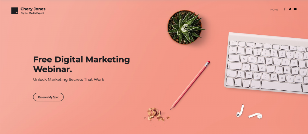
For example, if you’re a service-led business your logo is less important than a brand that is trying to sell products.
For service-led businesses having your logo to one side in the navigation bar is a good idea and changes the focus from your brand to the services that you promote.
Here’s a good example from a US marketing agency:
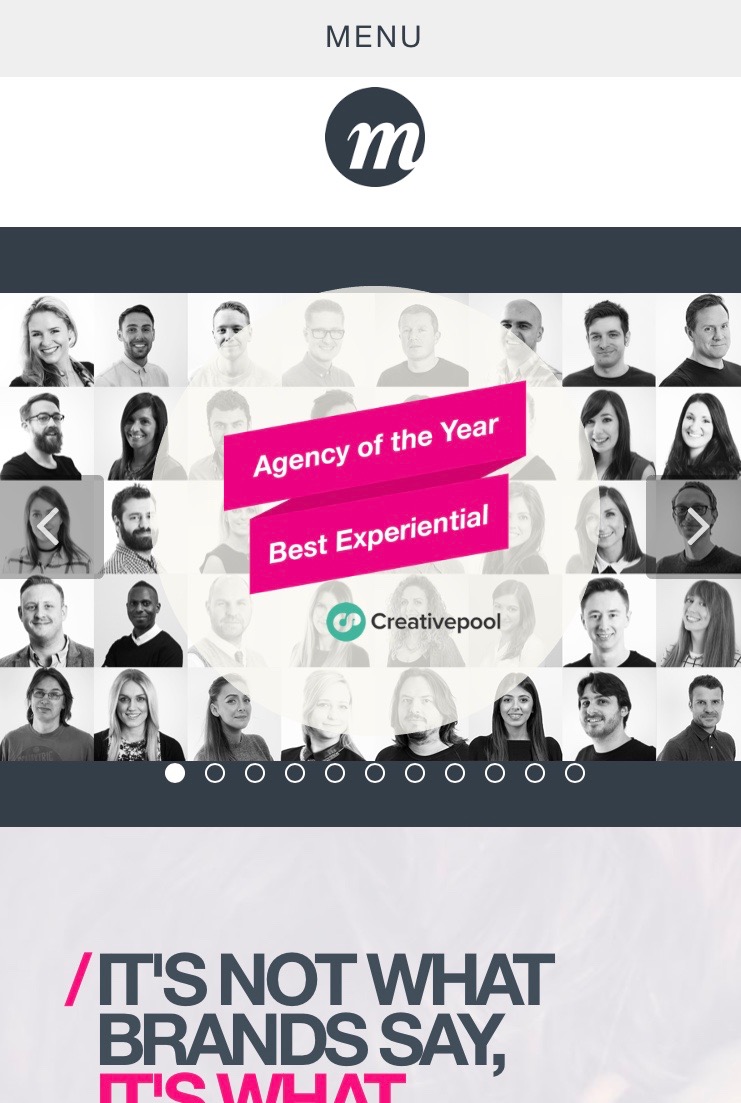
As you can see the logo is placed within the navigation bar to one side and the focus is on what they do as a company rather than the brand itself.
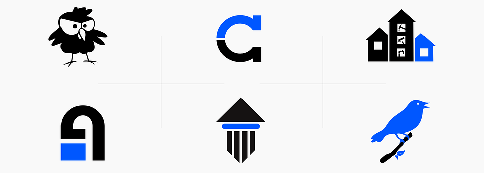
Now let’s compare that to a company that is brand-focused:
The logo is still at the same level as the navigation bar but it is now front and central, which is much better for brand recognition. It signifies to the reader to take notice of the logo and will increase the chances of them remembering what it looks like.
Menu bar design
How the menu bar looks and where it is placed within your template will also affect how people view and actually interact with your site in a big way.
It’s likely to be one of the first things your visitors will see and it will help them find the content they are looking for.
Here are some things you definitely want your menu bar template design to include:
- A clean and simple design that’s easy to use
- A simple background color that’s pleasing on the eye and contrasting text color for easy reading
- Create a hierarchy for your pages with the most important page closest to the left and least important closest to the right
You should avoid:
- Adding too many pages to the navigation tab
- Distracting backgrounds that make the tabs less clear and harder to read
- Using small complex fonts
We’ve found some great examples of the different types of menu bar design and listed the pros and cons to each one.
Fixed position menu bar (scrolls with you)
Take a look at the Wix Skooled template for an example of a fixed position menu bar.
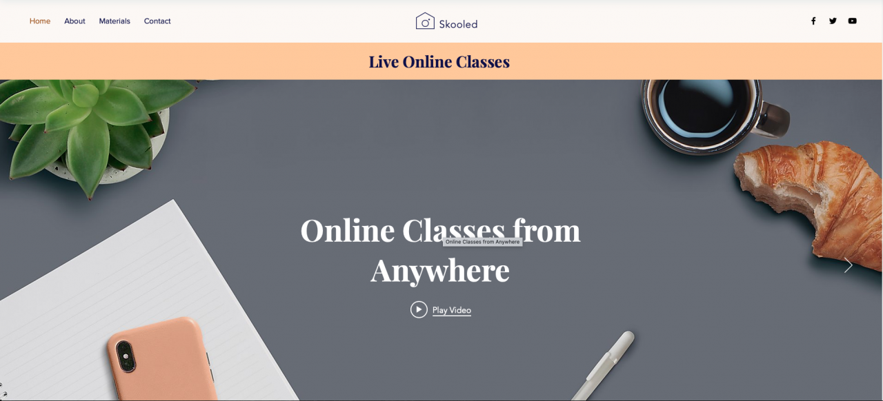
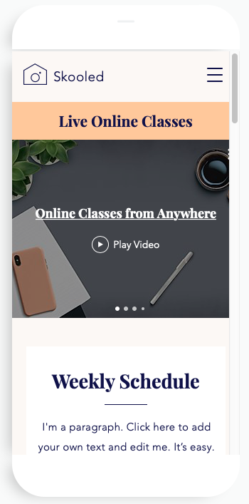
Having a menu bar that sticks to the top of the page is great for websites with really long pages and allows users to quickly click between pages without having to spend 30+ seconds scrolling back to the top of the page.
The downside is that there are fewer templates with this design so you will have less design options to choose from. It can also get in the way of your content as the user scrolls down, taking away from the overall aesthetic.
However, if you know that you will have a lot of content on each page it’s worth considering this type of menu bar, but only consider it if you really need it.
A static top horizontal menu bar
Shopify’s Artisan template is an example of a static top horizontal menu bar.
This is the most widely used menu bar design that people have become accustomed to when browsing the web.
The benefit of using this style is that people will naturally scroll to the top to find the navigation bar so you can create a seamless user experience by giving the visitor what they expect. It also allows the content on your page to be viewed without a menu bar obscuring a considerable chunk of it.
The only real downside is that on longer pages the user might get frustrated with a long scroll back to the top of the page to go somewhere else on your website. There is a danger that they will just exit if the page is too long.
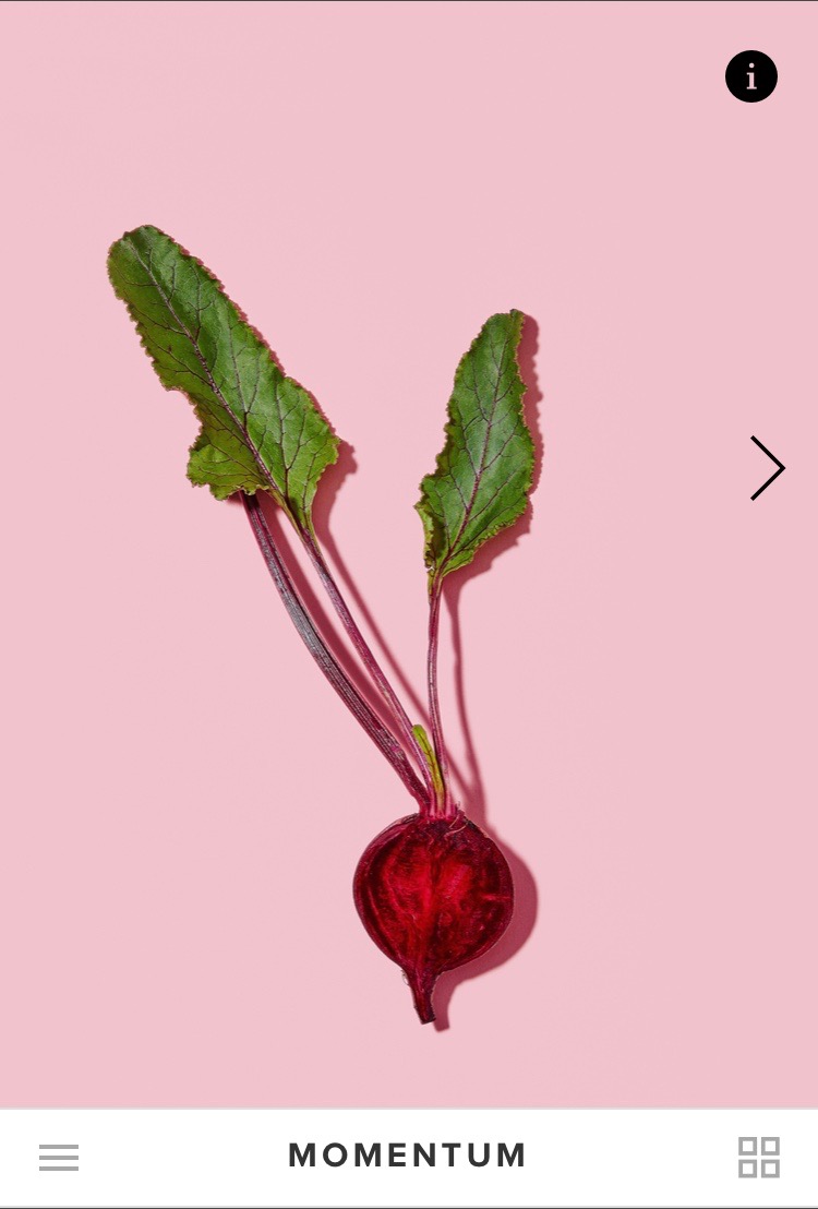
A side vertical menu bar
Check out the SITE123 Infinitea template for an example of a side vertical menu.
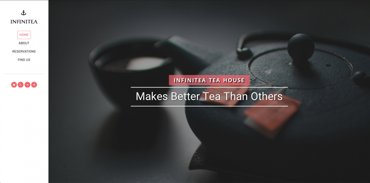
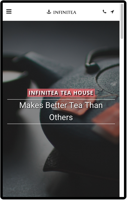
This type of menu bar design is great for graphic and image-heavy websites like restaurants and photography portfolios.
The side vertical menu is also great if you have a lot of navigation tabs to list or if the tabs have long titles as there is more room to play with.
The biggest downside is that they are not very common and most users have the habit of going to the top of the page to navigate. It could become frustrating for those visitors stuck in their ways and detract from the overall user experience.
However, the benefits might outweigh the negatives depending on your business.
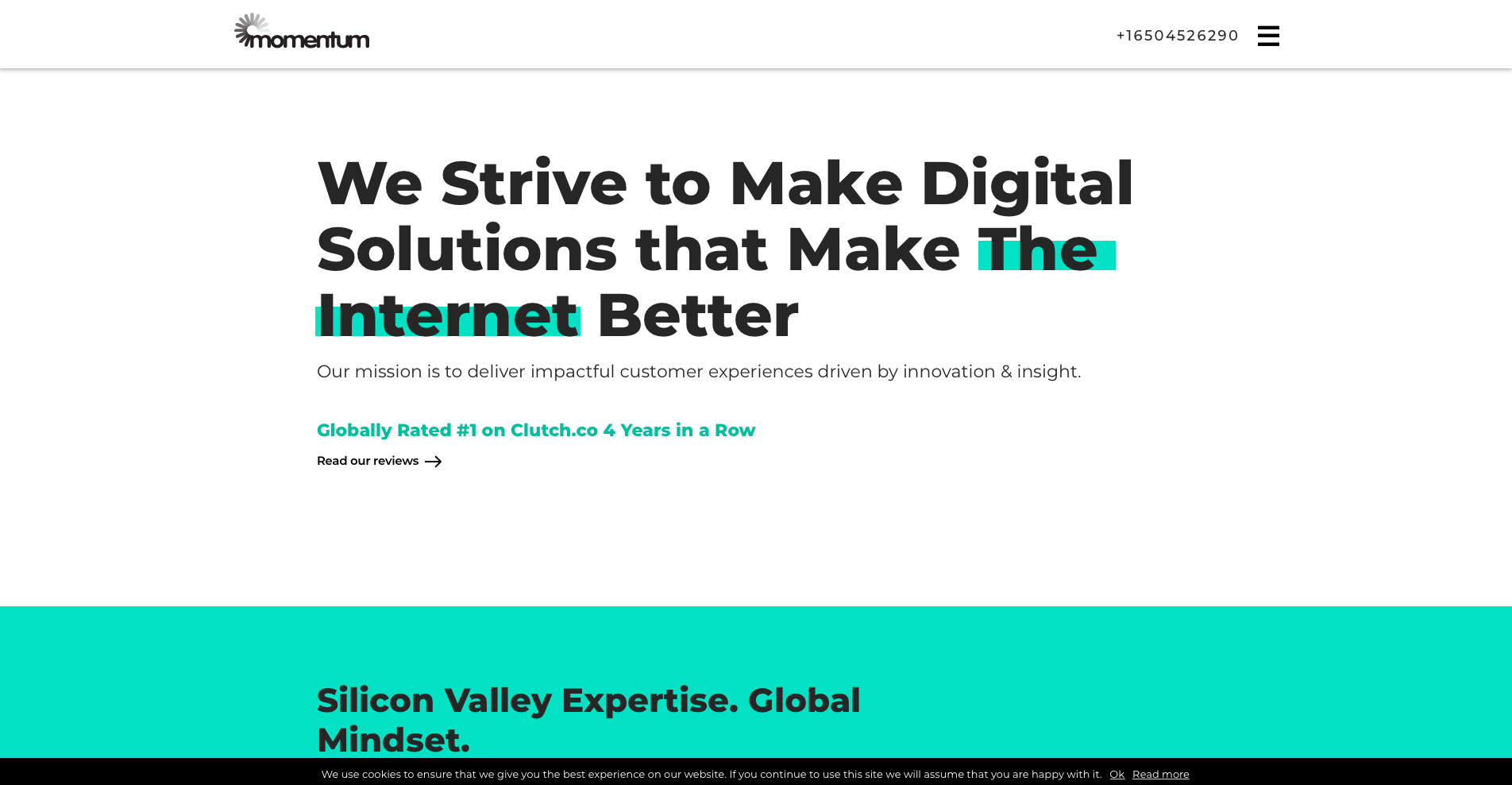
A bottom horizontal menu bar
Finally, the Momentum template from Squarespace is a stunning example of a bottom horizontal menu bar.
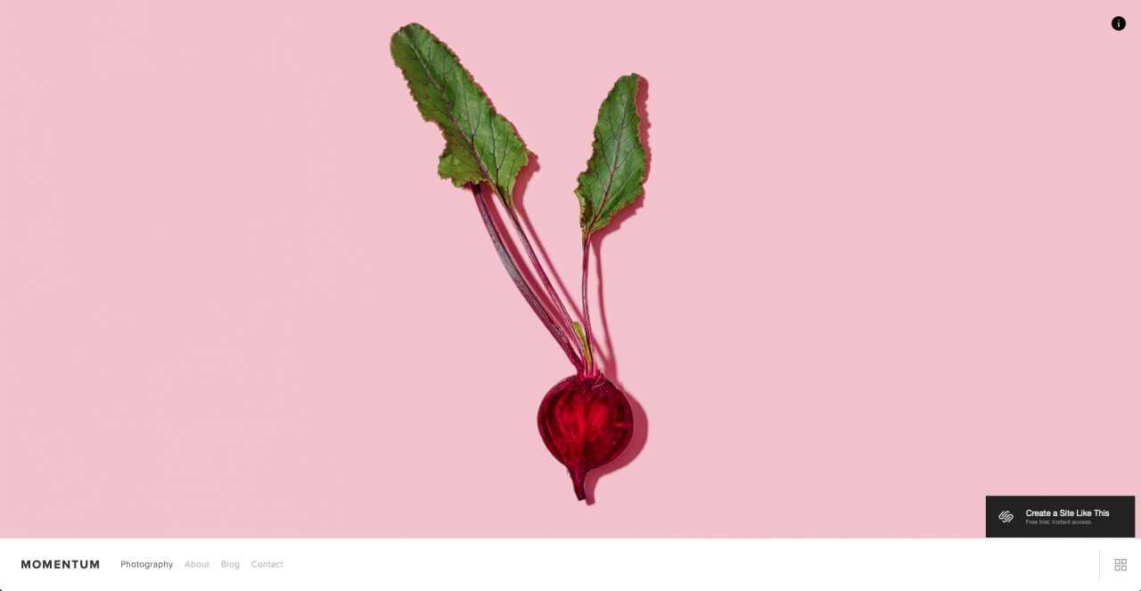
This style of menu bar is also great for websites that want to focus on images and graphic content.
The main benefit is that removing the navigation bar from where the visitor expects it to be, forces them to take notice of the content presented to them. This works great on photography, architecture, interior design, and other similar sites.
If you do choose to use this style of menu bar, placing lots of links within the content to help users navigate through your website will help to improve the overall user experience by reducing the need for a navigation bar.
However, (you might have already guessed) the downside is that for some users this will be confusing and they might choose to go somewhere else with more traditional navigation.
Home page header layout
The header area of your homepage is the first thing that will be seen by a visitor to your site and it will play a big role in their decision to either stick around or look somewhere else.
Website builder templates will have a particular type of header layout, most of which will look great, so how do you know which one to choose?
Again it depends on your business, your audience, and the intent behind your website.
Your header layout can either benefit or limit your website’s success so we’ve listed the different types of design and the pros and cons to each one to help you make your decision.
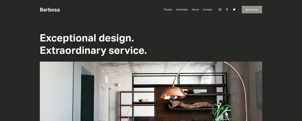
Static header image with no content
Big header images are something Squarespace is famous for and their Vandam template is an example of a static header image with no content.
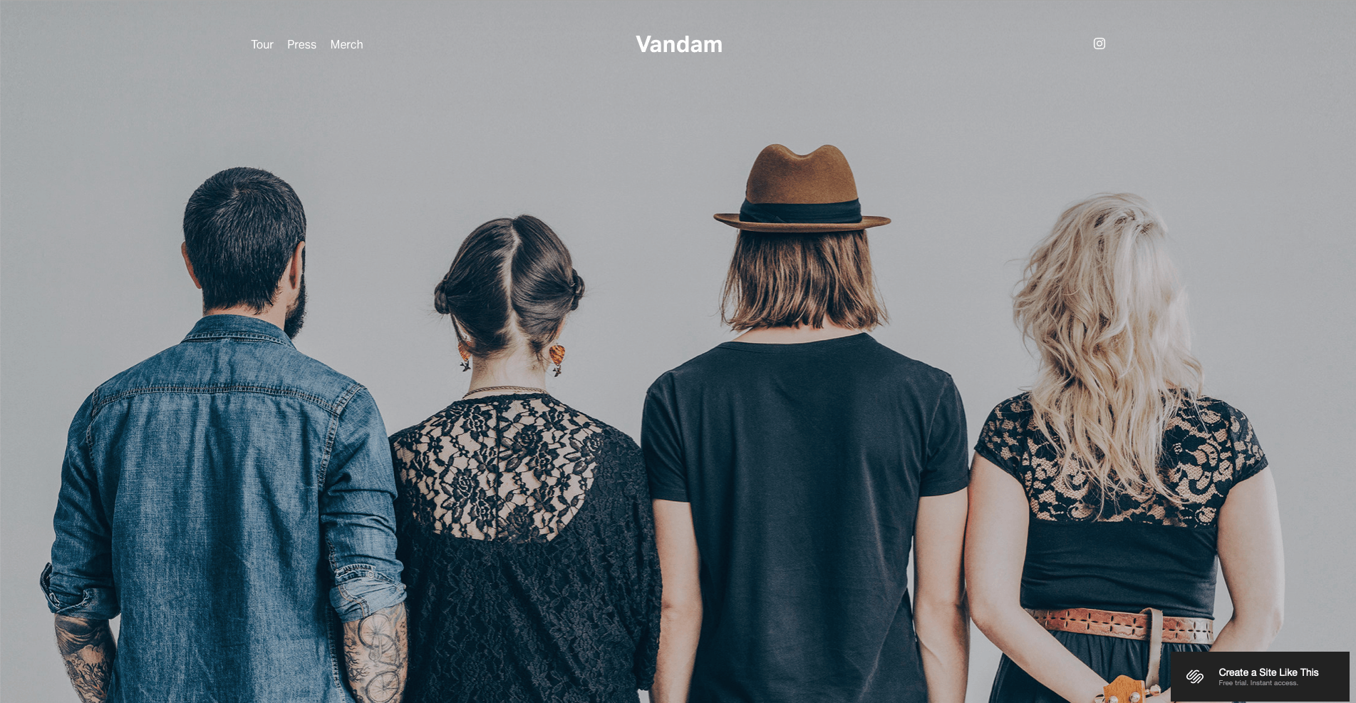

The benefit of this style of header is that it creates a stunning aesthetic that’s uninterrupted by text content. This works well for websites that want to showcase stunning locations, products, or photographs.
For example, a hotel business could lead with a beautiful image of their building because visitors don’t need much context to understand what is on offer.
However, this style is not good for businesses that need to provide context to explain their offer. It might be easy for a hotel to describe what they do with one image but a B2B marketing agency and other service-led businesses need some text content to describe their offer successfully.
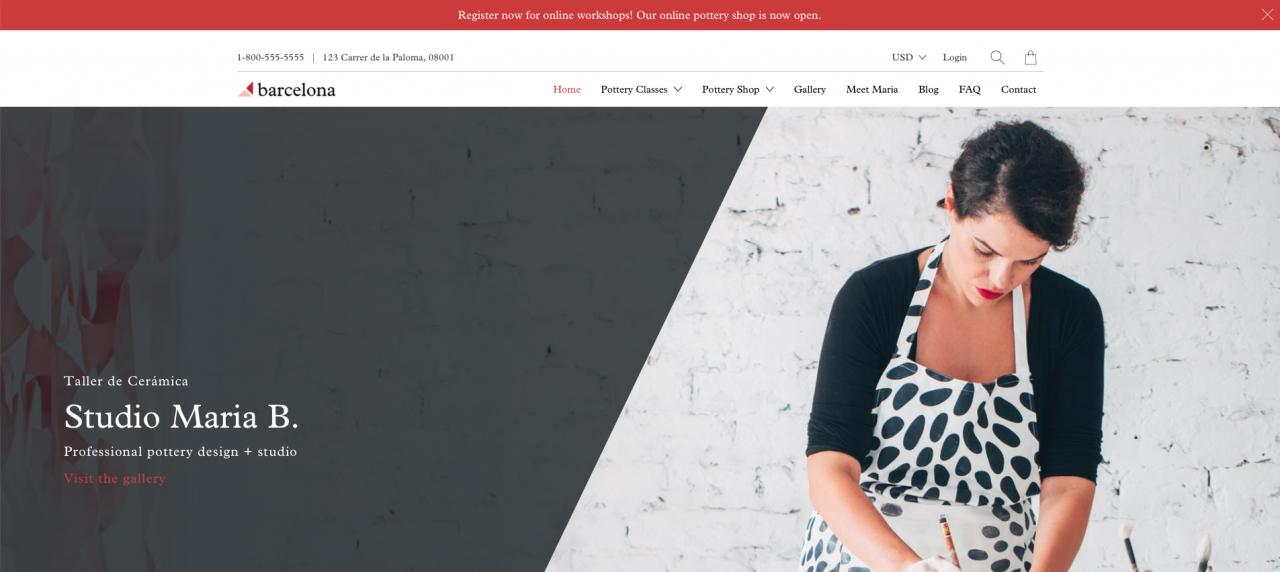
Static header with content
The Functional Studio template from Wix is an example that showcases a static header with content.
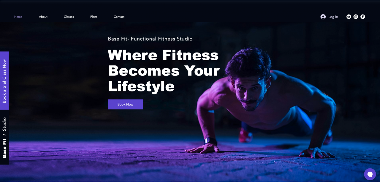
This is the most common choice of header layout because you get the benefit of a large hero image to create a good aesthetic with added text content to clearly describe to the visitor what the site is all about.
The headline – is used for the name of the business
The supporting paragraph – explains what the business does
The call to action – tells the reader what you want them to do
This type of header layout is good for any type of business because it’s a clear and simple method of welcoming people to your site.
Slideshow header with content
Shopify’s Handy template utilizes a slideshow header with content layout.
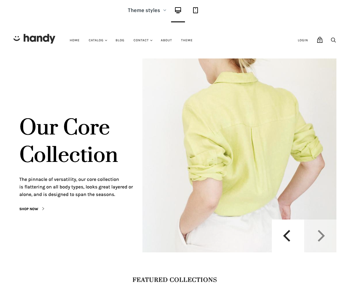
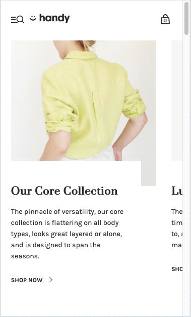
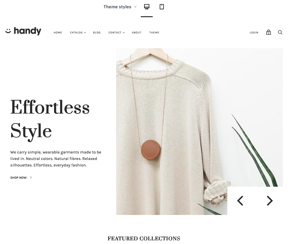
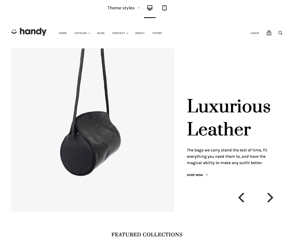
A slideshow header works well if you need to showcase a number of different products or services without making the visitor go off to a new page on your site.
This works particularly well for eCommerce sites that have a number of core products that they want customers to know about immediately.
Having the text content there as well provides an opportunity to start selling the product or service with carefully crafted sales copy.
However, there are some downsides to sliders which may make you think twice about using them…
If you’re not careful multiple offers may confuse people and what they came for might not be shown straight away.
For example, using the images from the example above, if I turned up to the website expecting to see leather handbags and saw image number one of a yellow shirt, I might think I’m in the wrong place and leave the site.
Also, the additional content can slow your loading times down and reduce your SEO performance.
Finally, there are more things to go wrong when the design is responding to different screen sizes, sliders are notorious for not working on mobile devices.
It’s all down to whether you think you need it and your customers would respond well to it. Just consider the downsides before jumping into this content-heavy option.
Customer support

Customer support is last on our list but should be in your mind at all times as you research template options.
It doesn’t matter if you’re making the simplest website ever or a really complicated design packed full of advanced features, at some point you will probably run into some issues and need some technical or expert advice.
Make sure that you can get access to support that you can use when you need it. Either by phone or a live chat system and that there will be someone available in your time zone so you don’t have to wait up until 1 AM to get some help.
It’s also worth checking out the platforms how-to guides and video tutorials to check if they are any good and have covered topics that you know you need to learn about.
Final thoughts on how to decide on a website template design
If you’ve made it this far you now know that there’s lots to think about when it comes to picking the right website template design for your website. It’s worth taking the time to really consider what you need not only right now but also in the future as your business grows to save yourself a lot of time, money and hassle in the long run.
In summary, the main things to consider are:
- Do the template and platform have the features and customization options your business needs?
- Is the template mobile responsive?
- Is it SEO friendly?
- What design features will suit my business (content width, menu bar style, header layout & logo placement)?
- Are the overall usability and user experience right for your audience?
- Can the platform you choose provide you with the support you need?
If you want to find out more about the design capabilities and other pros and cons of the world’s leading website builders, read our expert reviews on platforms such as Wix, Squarespace, Shopify, and many more.
Written By
What is a website builder?
The simplest answer to the question of what is a website builder is that it’s a software programme that helps you to build a website without having to manually code anything. But, how do they work?
Cheapest Website Builder 2021
Building a website doesn’t have to cost the earth. We’ve pulled together a list of the cheapest website builders and ecommerce platforms to help you find an affordable option for your website. Not only are they the cheapest, but some of them are the best of the best…
