Wix Website Examples – Get Inspired by 15 of the best (2021)

There are Wix website examples for all types of online businesses. However, not all of them are created equally. So, we wanted to pull together the best Wix website examples we could find to help inspire your own Wix website creations. We haven’t focused on one particular niche in this article because sometimes looking outside of your industry can help you to find an idea that allows you to stand out within your own circles. We will be covering a variety of websites to showcase as many inspirational web designs as possible.
So let’s dive in and take a look at some of the best web designs that have been created with the tools available on the Wix platform…
Iameveami.com
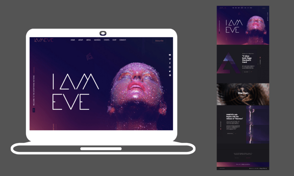
IAMEVE is a singer, songwriter, and storyteller who decided to use Wix to showcase her supernatural and ethereal productions. The website combines stunning images, video backgrounds, and interactive scrolling to create an irresistibly attractive website. It also showcases the ability to link with social accounts which is one of Wix’s strongest features for an artist’s website. IAMEVE has linked to her YouTube, Vimeo, Facebook, Instagram, Twitter, Deezer, Patreon, Apple Music, Pinterest, Soundcloud, and Spotify. So, web visitors can explore her work across a variety of platforms with just one click. This website also uses a template with a dark theme which we highlighted as one of 2021’s top web design trends.
Wix template used – Coming Soon Landing Page
Darrenhughesart.com
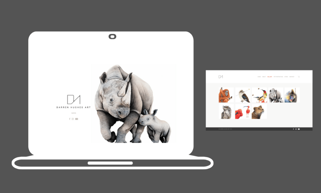
Darren Hughes Art executes a minimalist design that’s combined with hyper-realistic hand-drawn art to create a jaw-dropping website example. The home page acts as a barrier to the main website and visitors have to engage with the page by clicking ‘enter site’ before they can see the rest of the website. This only works if the contents of the front page can excite the visitor enough to click through. We think this example does just that as well as accurately showing what to expect from the rest of the website. Darren Hughes Art uses lots of white space to ensure that the visitors focus on the art rather than the website. This is a great tactic for photographers and artists to let their work do the talking.
Wix template used – Photojournalist
Olidillondesign.com
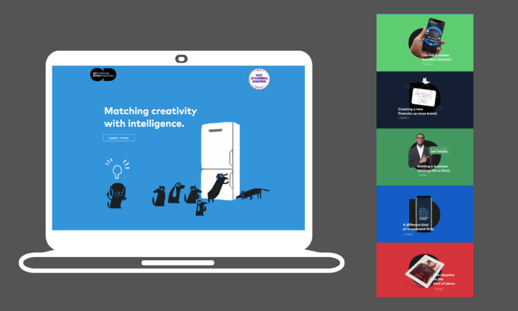
Oli Dillion Design utilizes the one-pager format effectively to showcase his portfolio of work in a simple but very attractive manner. Each project has its own content block with a unique color background, an image, and a single headline to describe the work. Keeping the words to a minimum on the home page has created space for the images and the headline to do the hard work of impressing potential employees. If more info is needed, visitors can click through to the project page that discusses each project in length. This creates a great user experience for anyone visiting as they are the ones in control of the journey across the site.
Wix template used – Webinar Landing Page
Runwild.design
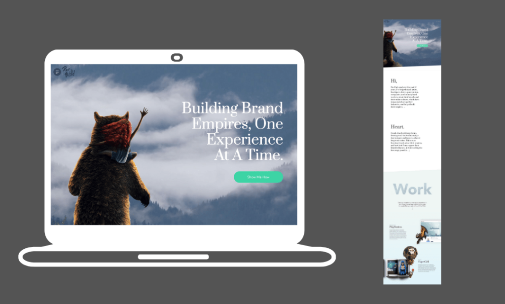
Run Wild design made the list of the best Wix website examples because it uses video backgrounds, 3D images, and a mobile-friendly navigation structure. Together all of these elements create a very attractive portfolio site. The 3D images create layers to the visitor’s screen with the help of shadows and blurring which creates something much more interesting than scrolling through a bunch of flat images and text. Finally, the mobile-friendly navigation structure that uses the three lines in the top left corner to bring up a whole page menu makes browsing the site on a mobile device a breeze. This is definitely something you should consider if you know a lot of your visitors will be arriving via mobile.
Woodpeckerinstruments.com
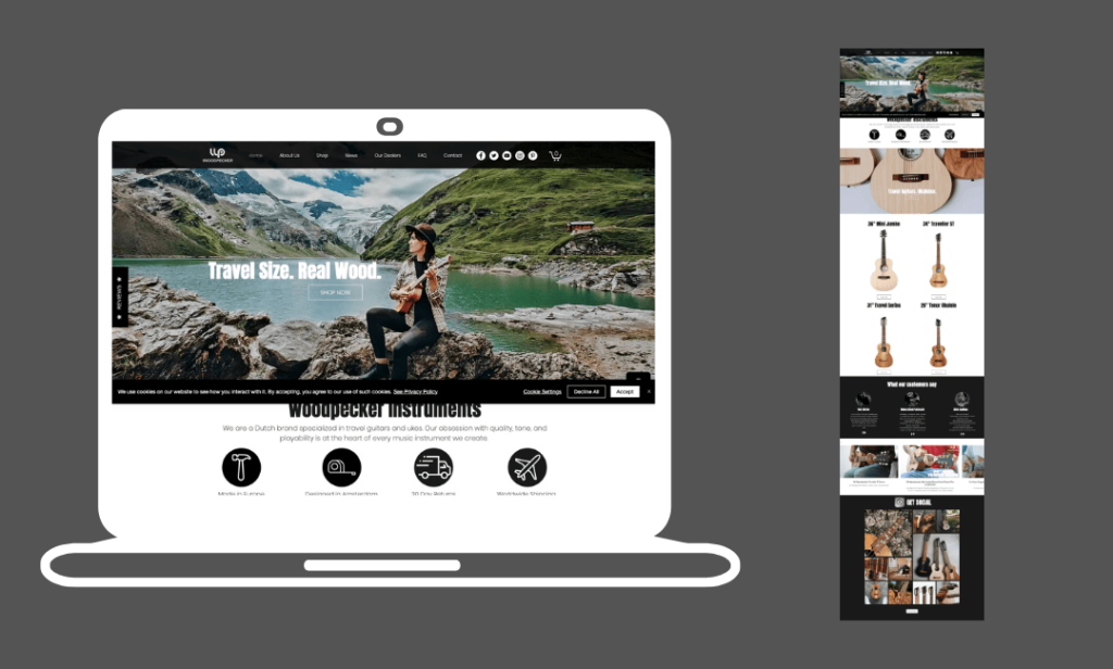
Woodpecker Instruments showcases some of the great eCommerce features available on Wix. As you can see there is an attractive highlighted products content block that allows you to list your most popular products on your home page. You can also link to Instagram to showcase social posts of your products. This creates social proof which is so important when building trust with your customers, especially if you’re a new business. To build your social proof even further you can use the testimonials content block like Woodpecker has to let your visitors know exactly what customers thought of your products.
Finally, if you click through to the website you’ll notice a little pop-up box appear in the bottom right-hand corner of your screen. This pops up every time there is activity on the store to show visitors that other people are buying the products which is another tool you can use to build consumer confidence in your brand.
Won80eight.com
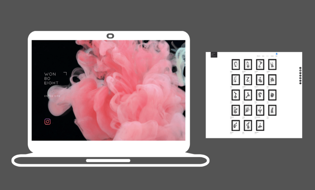
Won 80 Eight has used the same Wix template as Darren Hughes Art. However, this time the home page has an artistic video background that’s both visually stimulating and intriguing. It makes you want to click the ‘enter site’ button to find out what else is on the website. It’s another interpretation of how this template can be used to create a top-notch artist portfolio or artist online store. Again, it uses white space to let the products do the talking.
Wix template used – Photojournalist
Mildd.com
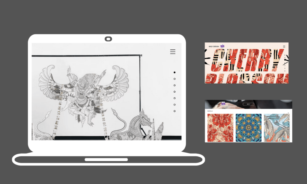
While some of you might not like the clashing color scheme of this website, there’s no question that it’s vibrant and memorable. Mildd has also taken advantage of the parallax scrolling feature available on Wix. It’s simple compared to what’s possible on other platforms, however, it makes scrolling through this site feel more interactive than static pages which should hopefully keep people engaging and looking at your content for longer.
Wix template used – 3D Design Portfolio
Krawec.org
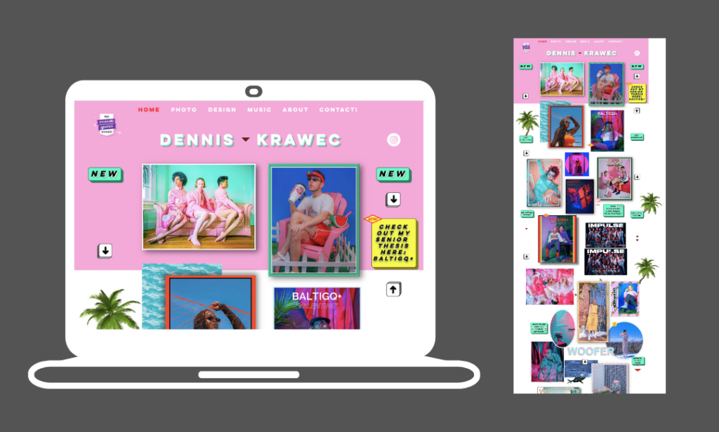
Krawec is another example of a portfolio website that uses an interactive gallery. It makes photography the main focus and provides an alternative way to navigate the website by clicking the links throughout the gallery rather than the traditional navigation menu which exists at the top of the page. This website is a great example of where the designer has linked their web design with their own values and personality. Dennis Krawec’s LGBTQ+ identity and interest in K-pop resonates throughout the website.
Jacobotoledo.com
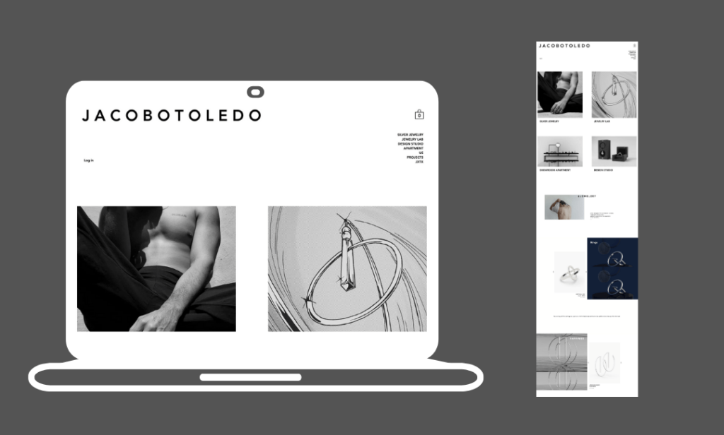
Jacob Toledo uses a stunning gallery to showcase his high-end, luxurious jewelry. The professional photography combined with the attractive gallery layout makes for a stunning design that does the job of making you feel like the jewelry listed on the page is exclusive and worth the price tag. The parallax scrolling means that the products come into view slowly. It builds a little suspense and makes the visitor engage with the page to reveal the whole product. This is a great example of how the Wix platform allows online store owners to present their products in unique ways that are more exciting than the traditional white background static image that so many online stores use.
Ocleanse.co.kr
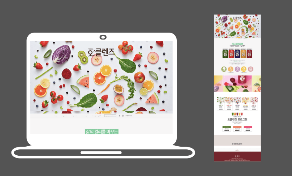
I don’t speak or read Korean but this is one of my favorite designs on our list of Wix website examples. Admittedly, I think the photographer and graphic designer have done most of the hard work in making this website great. However, the Wix template and content blocks have given them the framework to make this colorful design. It feels healthy, vibrant, and fresh which is exactly what the product will make you feel too. The product and the web design work together to tell the customer the story of what they will get if they buy one of the juice cleanses. Click through to the website to see how great a Wix image slider can look.
Positiveeq.com
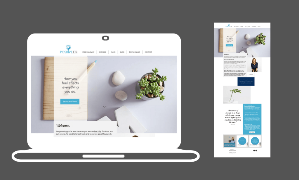
Positive EQ has created a professional service-led business website that’s informative, friendly, and builds trust. The blue color scheme is no coincidence. The color psychology of blue promotes feelings of calmness, serenity, security, and peacefulness. Which is exactly how this lifestyle coach aims to make you feel through her courses and one-on-one sessions. This website shows that you can create a stunning website, even if you only use the most basic content blocks available on Wix.
Animalmusicweb.com
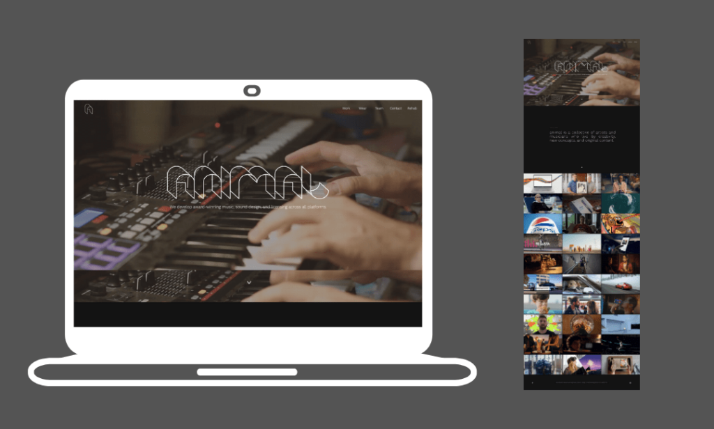
Animal music design soundtracks for advertising campaigns and other marketing activities. The Wix platform allowed them to showcase their work by embedding videos onto their website. Visitors can simply click one of the gallery tiles and the Vimeo MP4 files start playing right away. They have also used the video background feature and have applied the grainy effect which Wix users can apply to any image or video from the website builder editor.
Tobiasbecs.com
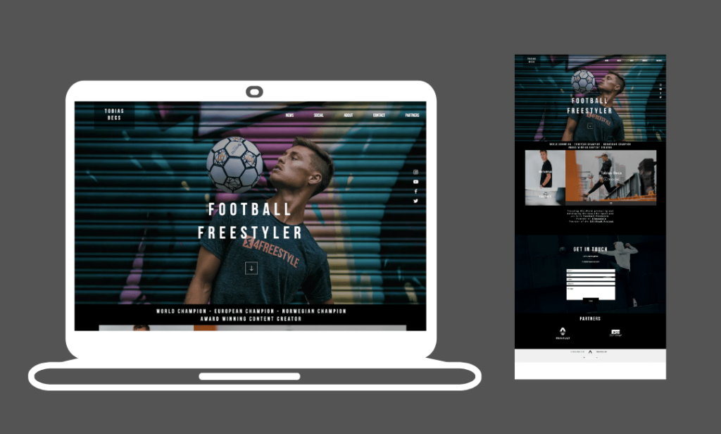
Here is another Wix website example that uses a dark theme to create a stunning web design. It’s the same theme as IAMEVE and Tobias Becs has included four social links so his web visitors can engage with him on other platforms at the click of a button. The website has only two pages, the home page, and a video blog page. This is a relatively unique format and one that might inspire others to keep it simple while focusing on video content rather than text.
Wix template used – Coming Soon Landing Page
Maxmontgomeryphoto.com
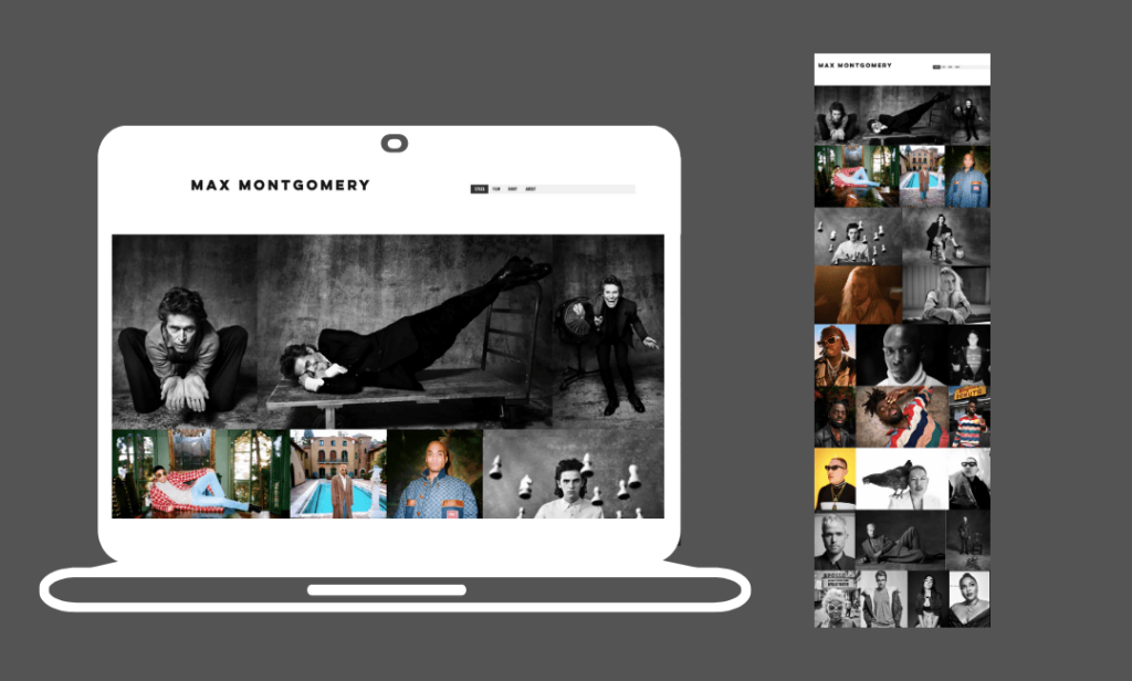
This is the portfolio site of a successful photographer. As you can see the Wix template provides an exquisite gallery to showcase Max’s photographs. The website tells a story as you scroll down the page and blends celebrity images with interesting stills from everyday life. Like any good photography website, the pictures do the talking.
Rafaelvarona.com
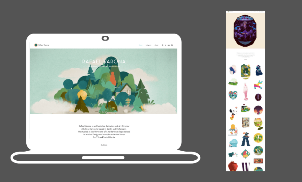
Rafael Varona is the last of our Wix website examples. He is an illustrator, animation artist, and art director. The header of this website uses a video background to create an engaging first impression. Then the rest of the home page features moving gifs which create an entertaining dynamic effect as well as accurately showcasing what Rafael’s work actually is. He has also chosen to link to his Instagram account which is embedded into his Wix site and can be accessed through the main navigation menu.
Final thoughts on the best Wix website examples
Hopefully, this list of websites made with Wix has inspired you with your own Wix web designs. Even if the websites in this list don’t match your niche, the idea is that you can take elements from these fantastic websites and adapt them to your own style and industry. This will allow you to create something new and unique to help you to stand out from your closest competitors.
If you want to find out more about Wix before signing up, then check out our in-depth Wix website builder review to find out about its features, pricing and so much more.
Written By

Cheapest Website Builder 2021
Building a website doesn’t have to cost the earth. We’ve pulled together a list of the cheapest website builders and ecommerce platforms to help you find an affordable option for your website. Not only are they the cheapest, but some of them are the best of the best…

Web Design Trends 2021
Discover the biggest trends in web design that will emerge online throughout 2021. 3D & VR, Personalization, Parallax animations and more…
