How to create the best ecommerce website in 5 easy steps
There’s no doubt about it, ecommerce is booming. While many industries are struggling during the coronavirus pandemic, the ecommerce industry has seen a sharp increase in the total money spent online. This is because consumers are forced to order products from the internet while shops are closed and brick & mortar businesses are pivoting to online business models to keep afloat during restrictions. Even without the coronavirus accelerating the growth of ecommerce, it was already in an upward trend. A 2019 forecast predicted that global ecommerce would rise by 20.7% to $3.535 trillion despite rising economic uncertainty. So, there’s never been a better time to get involved.
If you’ve clicked through to this article then you’re most likely thinking about how to create an ecommerce website. Well, this article has been written to outline all the things you need to think about when creating your own ecommerce business from start to finish. The why is already obvious, it’s a booming industry and one that allows you to be the boss. So, we’re going to concentrate on the how. Follow our 5 simple steps to create a professional ecommerce website.
1. Decide on your product(s) & finding your niche

One of the great things about ecommerce is that you can sell absolutely anything. However, the secret to finding success is selling a product that solves a problem for a particular niche of people. How you do that is up to you, but here’s a few ways that you can get products to sell:
- Invent a brand new product
- Order branded versions of existing products
- Create a dropshipping model where you sell other people’s products for a higher price
- Produce digital products like fitness programs or recipe videos
While ecommerce giants like Amazon and eBay have been successful at selling everything to anyone, it’s much better to focus on a niche group of products and people for independent ecommerce business owners. Here’s a great example of finding a niche:
Boot Buddy – is a tool that helps sports players clean their muddy sports shoes. It works on everything from soccer cleats to golf shoes. It’s a great product because the Boot Buddy tool is solving a specific problem, muddy boots. The owners of Boot Buddy know exactly who to target with their marketing campaigns and it’s easy for customers to understand exactly why they would need a Boot Buddy.
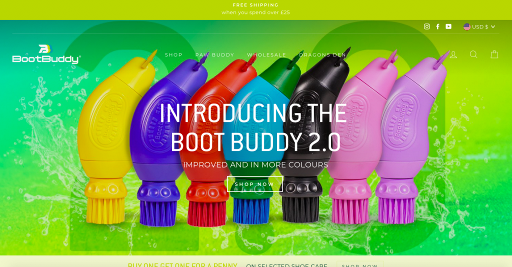
So, the easiest way to create or find a product that will sell well is to think of a problem that you or other people have, and solve that problem with a product. The more specific you get, the more likely it will sell to that particular audience.
2. Get ready to sell

Having everything set up and ready to go before you create your ecommerce website will speed the whole process up and prevent you from hitting a frustrating roadblock just when you thought you were ready to start selling. Here’s a list of everything you should get ready and decide on before you create your ecommerce site:
- Choose a business name
- Register your business and get the correct paperwork
- Create a business bank account
- Setup the payment processors that you want to use to collect money from sales
- Decide on the price you want to sell your products at
- Workout shipping and tax costs
- Purchase a domain name
- Create a business email address
3. Develop a keyword strategy for your ecommerce store

There’s just one more thing to do before you can let loose on the website builder and start developing your site… and that is developing a keyword strategy that you can use throughout the creation of your website. Conducting keyword research before you create your website will enable you to include keywords throughout your initial website content.
Having a clear understanding of the search terms that potential customers are using when searching for products like yours will help you craft content that is relevant to what they are looking for and allows you to answer actual questions they have about your type of product. The keywords can feed into your home page, FAQs, product descriptions, and blog posts.
The best source of keyword data comes from the Google Keywords Planner tool. If you have a Google Ads account you can access it by clicking on the ‘Tools’ tab and then clicking on the link to the ‘Keyword Planner’. Alternatively, you can use tools like the SEMrush Keyword Magic Tool or the Moz Keyword Explorer tool to generate keyword ideas and data.
4. Pick an eCommerce platform
How to create the best ecommerce website in 5 easy steps
Read Full ReviewHow to create the best ecommerce website in 5 easy steps
Read Full ReviewThis is another stage that you will want to spend some time thinking about before you commit to a platform because once you go live and start selling to customers, you don’t want to realize you’re missing a core feature that requires you to migrate your site to a new platform. Luckily we’ve done the time-consuming research for you and have compiled a list of the best website builders for ecommerce businesses, complete with in-depth reviews on each brand. Our top three brands include Wix, Shopify, and Weebly.
When trying to decide on which ecommerce platform is best for you, take a look at the criteria below and consider what brand ticks the most boxes for what’s important for your business.
Pricing and fees
Most website builders will have a few options when it comes to monthly subscriptions which mainly differ between the amount of storage and bandwidth offered and will usually unlock advanced ecommerce features for the more expensive plans. Some brands also charge a transaction fee on top of the monthly subscriptions so be sure to find out what you will get charged and factor that into your product costs.
SEO
Unfortunately, no website builder will have perfect SEO features, however, some are better than others. The key things to look out for are fast loading times, friendly URLs, the ability to create HTML headings, the ability to create a blog and you want the schema data to be present and working correctly. Our in-depth website builder reviews outline what each brand has and hasn’t got in terms of SEO, so check them out for more detail.
Design options
Take a look at the web templates available and the types of content blocks you can include on your website. Make sure it matches the look and feel that you want to create and that it allows you to add the functionality you want.
Ecommerce features
Some platforms have a long list of advanced ecommerce features like sales coupons, product galleries, custom checkouts, abandoned cart recovery, and lots more. While others might simply let you list products and connect a payment gateway. Make sure you have everything you need built-in to the platform or an app market place where you can install additional features via web applications.
Security
Does the website builder come with free SSL certification? If you are going to sell products online, you need one! So, if you can get it included in your monthly subscription cost you might as well.
Mobile-friendly
It’s a safe bet that the website templates offered by website builders will be mobile-friendly but it’s worth double-checking as around 50% of your visitors will be using mobile devices. It’s also worth checking if the editor has a mobile preview available so you can check what your designs look like on a mobile screen size before you hit publish.
Can it scale?
Finally, can the platform accommodate your needs as your business grows? Yes, you might only be selling one product today but what will you need in three years? Make sure that the platform is advanced enough to help you keep growing long into the future.
5. Design your ecommerce store
It’s now time for the fun bit, actually building your ecommerce website and turning your idea into a reality. The common theme between all of these steps is that taking some time to think about exactly what you want to do and understanding why it’s important for your store will help you to get everything right the first time around. This is critical when it comes to designing your website because it is the only thing that can actually convert your audience into paying customers. We’ve outlined the core aspects of any successful ecommerce website below so that you can start thinking about how they will look on your own online store.
Pages and categories
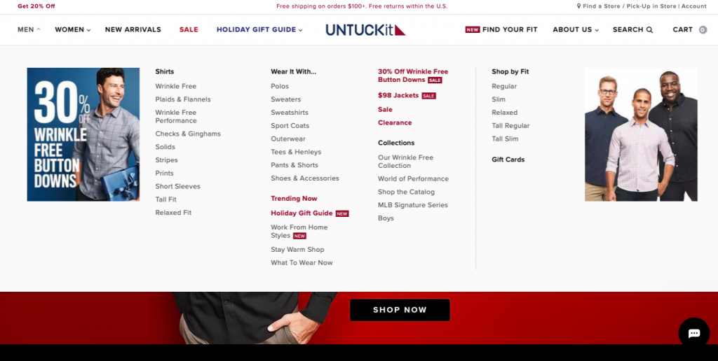
One of the first things you’ll need to decide on is the pages and categories you want to include. You’ll at least want a home page, product pages, and a contact us page but it might also be beneficial to your business to have an about us page or an FAQ page. In terms of categories, you’ll want to split up your products into logical groups that match how people are likely to shop. For example, if you sell office furniture & equipment you could have a product listing page for chairs, desks, laptop stands, monitors, and so on. That way someone visiting your site who is looking to buy a chair will be able to quickly and easily locate all of the relevant products on your site.
Site architecture & navigation

Once you know the types of pages and the product categories you want to use, you can then use this to set up an SEO-friendly site architecture and user-friendly site navigation. For SEO you want your site structure to be logical and easy to understand so that the search bots can quickly make sense of the layout. Using the image above as a reference point you want to make sure that you give the most important pages the most visibility with logical links to other pages and category pages on your site. Always start with the home page and work down from there. This will feed into your URL structure which ideally would look something like website.com/office-furniture/chairs/office-chair-pro/. This link has gone from the home page to the product category, then to the subcategory, and then to the specific product.
Setting your site architecture up correctly will naturally create a website that’s easy to navigate and therefore will improve your user experience. The main thing that it will do is make sure that the visitor doesn’t have to click through loads of pages to get where they want to be. Additionally having a clear menu structure will mean that the visitor can get back to any point of the website with just one or two clicks which increases the chances of them hanging around for longer.
Customer testimonials & reviews
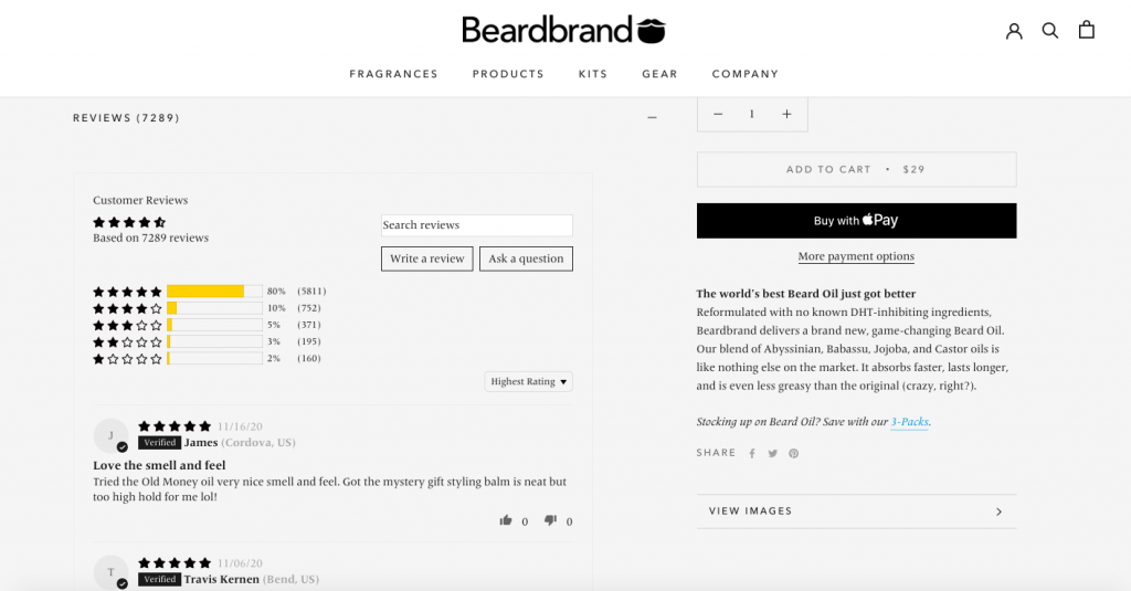
Some research indicates that businesses can generate up to 62% more revenue with the presence of reviews. They work because they help to create a deeper and more emotional response to your brand and products. They build trust because potential customers can see that existing customers are pleased with the product and it then increases the likelihood of them becoming a customer because there is less doubt around if the product is good or not.
Include some highlight customer testimonials on your home page and have a reviews section on each of your product pages. Don’t be tempted to put up fake reviews because they are easy to spot and it will have the opposite effect on consumer trust and loyalty to your business. You might get lucky and have a stream of organic reviews appear on your product pages. However, that might not happen… When you’re starting out don’t be afraid to ask your customers for an honest review, you could even incentivize them with a discount code for the next time they shop. Once you have a few reviews already on the page, others are more likely to post their own.
Shopping cart and checkout
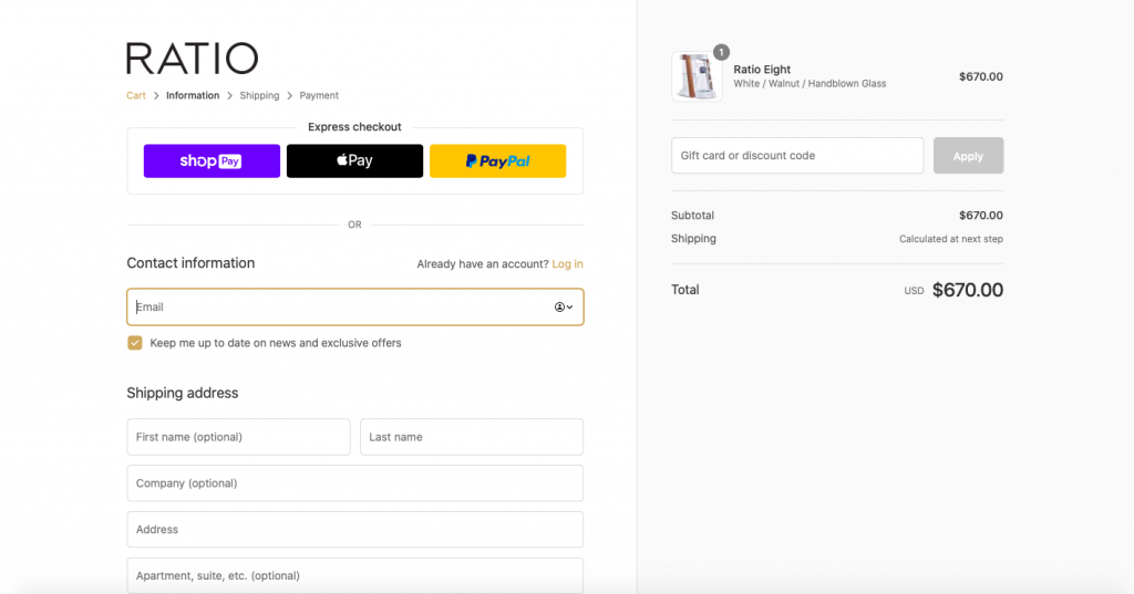
Make sure that you have a shopping cart set up so that your visitors can add products as they browse through your site. It makes their shopping experience easier as they have more time to decide on what they want rather than having to click through to purchase straight away.
The checkout process is the final stage in the buyer’s journey and even if the shopper loves the product they are about to buy, a poorly design checkout page can stop them from completing the purchase. You want to make sure any forms are easy to fill out with minimal information required. Offer a variety of payment methods so that the buyer is not stopped from completing a purchase simply because they don’t have a specific payment method. Finally, make sure it’s secure and that the buyer knows it’s a secure checkout through the use of trust marks.
List your products with awesome product descriptions & images
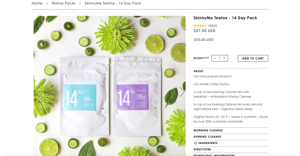
Your product pages are the most important pages on your ecommerce store. Think of them as your sales team whose sole purpose in life is to convert website visitors into paying customers. Getting the design and layout right is vital to success.
Here are the three most important elements to your product pages:
High-quality images
Online shoppers can’t feel or touch your products so the images you provide need to bridge this gap by making your product look so good that shoppers want it, even though they can’t have a proper look at it. Include images of the product from multiple angles, some of the product being used, and a short video if possible.
Features and benefits
Simply listing features just doesn’t cut it anymore and your conversion rate will suffer if you only list features. However, if you take the time to spell out the benefits of each of your product features then you will have a better chance of convincing your shopper to buy. It allows you to answer the ‘why is this product good’ question that every shopper has in their head while browsing for something to buy.
Emotional language & Call-to-actions
Boring product descriptions are as good as having empty shelves in a brick and mortar store. The language on your product pages needs to be filled with emotion so that shoppers can get excited about your products and get the same emotional reaction they might have while looking at your products in person. Also don’t be afraid to signpost to your shoppers exactly what you want them to do with specific call-to-actions like ‘Buy Now’, ‘Get Yours Today’, and ‘Add to Cart’.
Final thoughts…
Thanks for taking the time to read this article, I hope that it has helped you understand what it takes to create a successful ecommerce store. If you want to find out more about the ecommerce platforms that you can use to set up your online store head over to our ecommerce website builder listings page and have a look at the in-depth reviews. The main take-outs are that you need to find your niche and find an ecommerce platform that has everything you need right now and what you need as your business grows. Finally, make sure that your buyer’s journey is easy and entertaining. If you do all of those things you’ll be on track to create a successful ecommerce business.
I’ll leave you with a video from Foundr magazine who talk to one of Shopify’s most successful online retailers, Greta Van Reil. Someone that can make $600,000 a month selling tea on Shopify is worth listening to!
Written By
What is a website builder?
The simplest answer to the question of what is a website builder is that it’s a software programme that helps you to build a website without having to manually code anything. But, how do they work?

Cheapest Website Builder 2021
Building a website doesn’t have to cost the earth. We’ve pulled together a list of the cheapest website builders and ecommerce platforms to help you find an affordable option for your website. Not only are they the cheapest, but some of them are the best of the best…
